


Published: December 1, 2016
Updated: April 11, 2024

How do you guide a new user to succeed using your product? It’s a question we often ask ourselves as it’s critical to retention and growth. We recently redesigned our user onboarding from the ground up and we’re sharing our process in the event it helps as you design your own product or service.
User onboarding is a hot topic among product managers and UX designers, and for good reason.
Dumping a new user into an empty dashboard is a sure way to make them close their browser tab and never come back. People trying out a new product need to be guided from the very start.
Done well, user onboarding enables a new user to find success with your product faster so they are more likely to get hooked and, ultimately, become a paying customer.
Here at Proposify, we’ve found the biggest challenge for new users signing up for a trial of our product is that it can take some upfront time and effort to derive the full value from our product.
Here’s what a new Proposify user needs to do to win a proposal (the ultimate success metric):
- Create or modify their proposal template.
- Build out their content and image library.
- Have a real, live sales lead to send a proposal to.
- Customize their proposal for that client.
- Send the proposal.
- Wait for their client to view and sign off on the proposal.
And there are a few things that can go wrong during that process:
- A new user may not have an actual proposal to send.
- They may not have the time or ability to rebuild their proposal format in our software.
- Their client may (gasp!) decline their proposal.
Once Proposify becomes part of a person’s internal workflow and all the systems are in place, it does make the proposal process streamlined and painless, but getting users to that point is where the real work lies.
So with that said, let’s look at what our onboarding looked like (in place for over a year) before we decided to change it.
Our old onboarding process
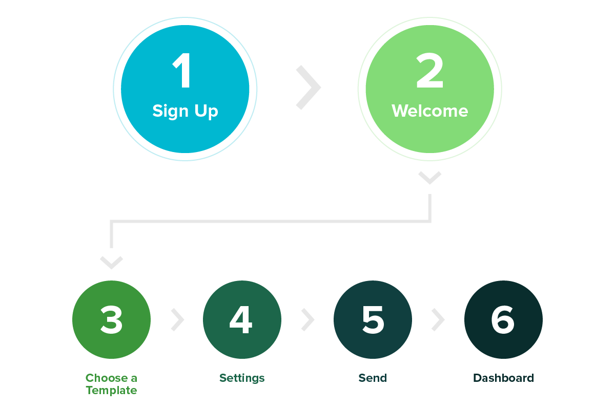
Step 1, sign up for a free trial.
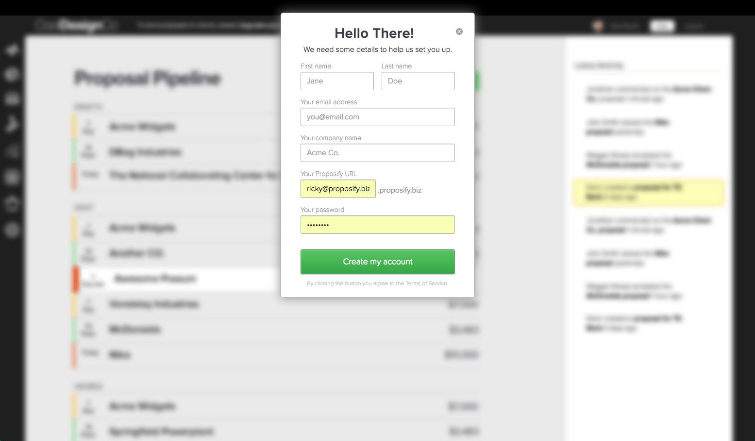
Our signup page has looked pretty much like this since we launched our beta (although we added social sign-in to test earlier this year). Our signup page continues to convert very well.
Let’s move on!
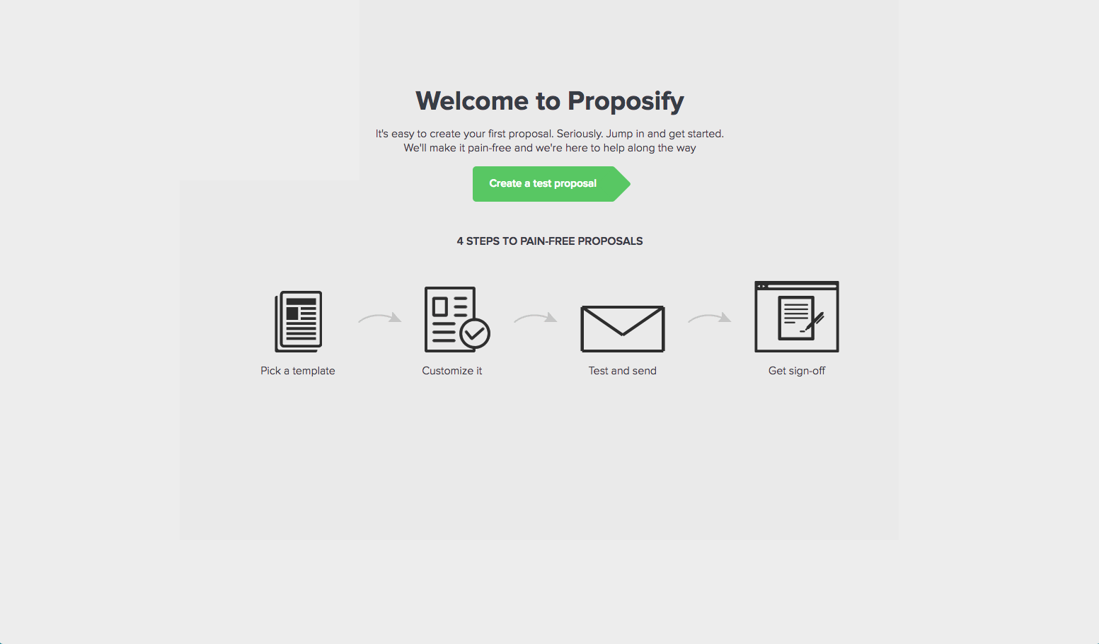
Here we laid out the overall process for deriving value from Proposify.
First, pick a template. Next, customize and send it. Then, wait for your client to sign off.
Then there’s only one place to go from here which is to create your first test proposal.
Can you spot the problems here?
First, we tell the user the overall process instead of showing them.
Second, we assumed the user wants to send a test proposal first when they may prefered to send a real one to start.
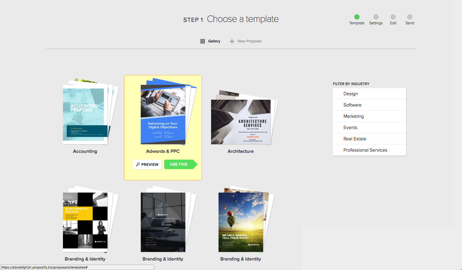
Next, we took the user to the proposal template gallery and made them choose a template.
Another problem here: Instead of guiding the user through how our software can benefit their sales process, we’re getting them hung up on the content and design of their proposal template.
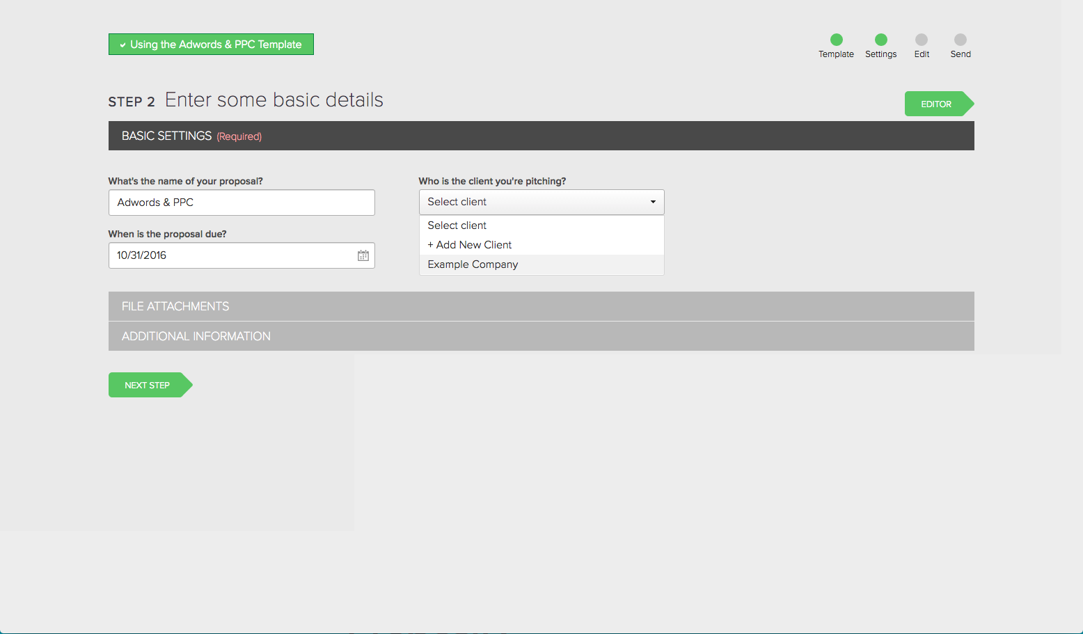
Then we asked for details on the proposal like name, client, and due date.
Problems: The user sometimes wondered, “Wait, isn’t this just a test?”, “What do I choose for a due date?” or “Who is ‘Example Company’ and where will this send to?”
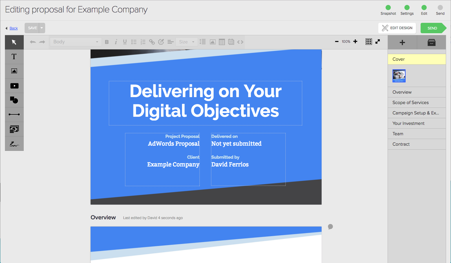
Then we dumped the user into the editor, which can seem complex if you aren’t overly familiar with design tools like InDesign.
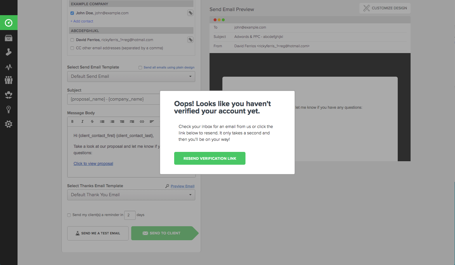
When the user went to send the proposal we made them verify their email first. Still a bit of friction there.
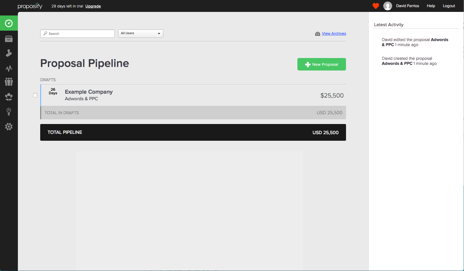
Finally, we displayed the user’s proposal in their actual sales pipeline. Which doesn’t make a ton of sense if it really is just a test proposal.
The problems
Could you spot some of the challenges with our old onboarding process?
- Most people want to send a test proposal to themselves first to see the process before sending a real proposal to a client. We were blurring the lines between a test and a real proposal instead of actually showing them how it all comes together.
- We were eating up users’ mental energy by making them look through proposal templates and choose one instead of demonstrating the value of the product.
- Many people who jumped into the editor were overwhelmed by how much you can do with it and then reached out to support with basic questions like, “How do I add a signature”? Apparently a lot of people don’t search your knowledge base or watch help videos when trying out a product. Go figure.
- Users’ test proposals were skewing their sales metrics and pipeline.
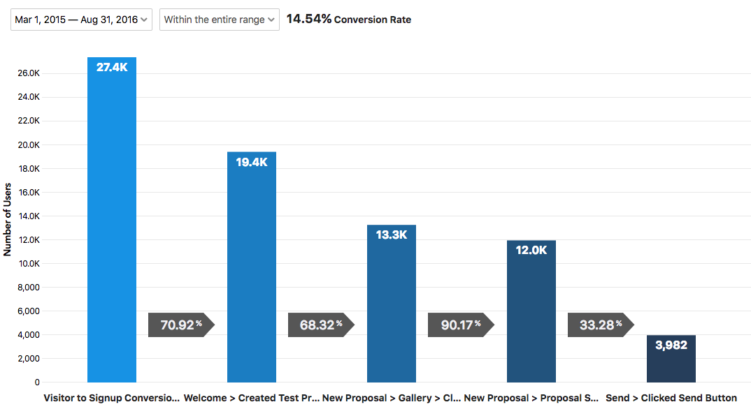
When we analyzed the funnel, we found just over 14% of users who signed up for a trial were actually completing the onboarding steps.
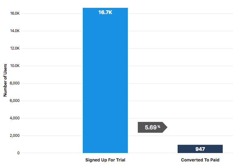
From a business standpoint, we saw that the percentage of users who signed up for a trial and then upgraded to a paid account was uncomfortably low. It was the number one metric we were trying to move the needle on.
To get more paying customers, you need more active trial users — people using the product and finding some success.
A confused or apathetic user is unlikely to look for the upgrade button.
When you’re looking at onboarding it’s important to know what your activation metric is. In other words, the action a user takes to indicate they are “active” or are deriving value from the product.
So what do we choose as our activation metric?
Using the example of an analytics product like Mixpanel, if a user copies and pastes the installation script on their website, they are then considered “active” and can start accessing useful data. If the user just signs up but doesn’t install the script, then they can’t even begin using the product or experience any value.
The activation metric for proposal software is more complex because of the aforementioned upfront work involved, it’s not as simple as copying and pasting a script.
For us, we know anecdotally from talking to customers that those who win a proposal are more likely to become a paying customer. But we can’t wait that long to onboard them. We need a way to determine if users are active long before they win a real proposal.
Getting insight and inspiration
Before jumping right into the design, we wanted to gather as much insight as possible from people who know onboarding.
We read blogs, finding the teardowns by Samuel Hulick from User Onboard especially useful.
We bought his book, Elements of User Onboarding.
We also tried out a lot of other SaaS products during this time, both direct competitors and non-competing products, to see how they handled user onboarding.
One SaaS product in particular that inspired us was Canva, a graphic design tool that anyone can use. If someone should know how to train up newbies on design software it’s them, right?
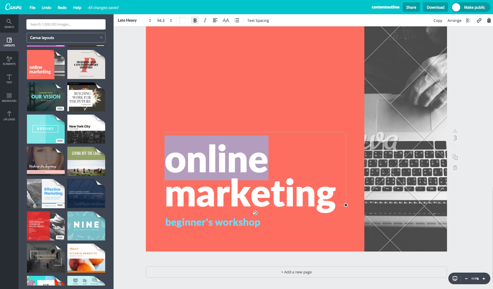
A light bulb moment came when we saw that Canva didn’t just show new users how to edit a sample document, instead the sample document contained visual instructions on how to edit it!
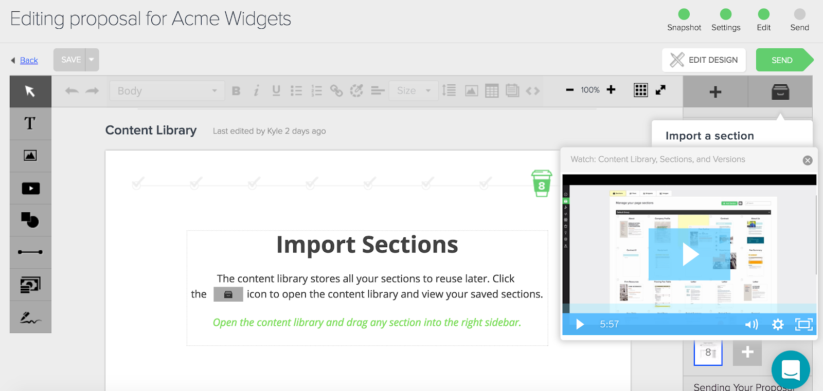
We knew we wanted to do this, so we set out to design a document template that walked our users through all the actions of the various tools in our software, like editing text, and adding fee tables, images, videos, and signatures — complete with animated gifs showing how to do it.
I’m a big fan of using paid SaaS tools where we can instead of doing custom builds so that our development team can stay focused on our core product.
To that end, we explored tools that automate user onboarding, namely Chameleon.
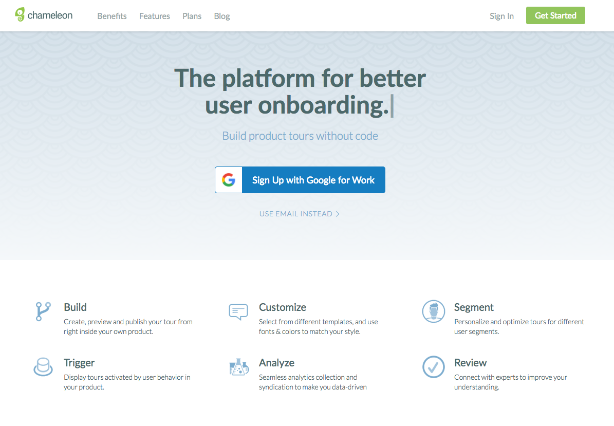
Chameleon allows you to create walkthrough tours within your product. Insert their code snippet and it comes backed with WYSIWYG tools that let you write and customize the tour, plus it’s got some nice segmenting and tracking features.
But in the end we chose not to go with Chameleon because we needed something a bit more comprehensive than just highlighting aspects of our UI. So we decided we did need to build it in-house.
Once we learned how other products were onboarding, our own strategy to take Proposify’s onboarding process to the next level started to crystalize.
The strategy
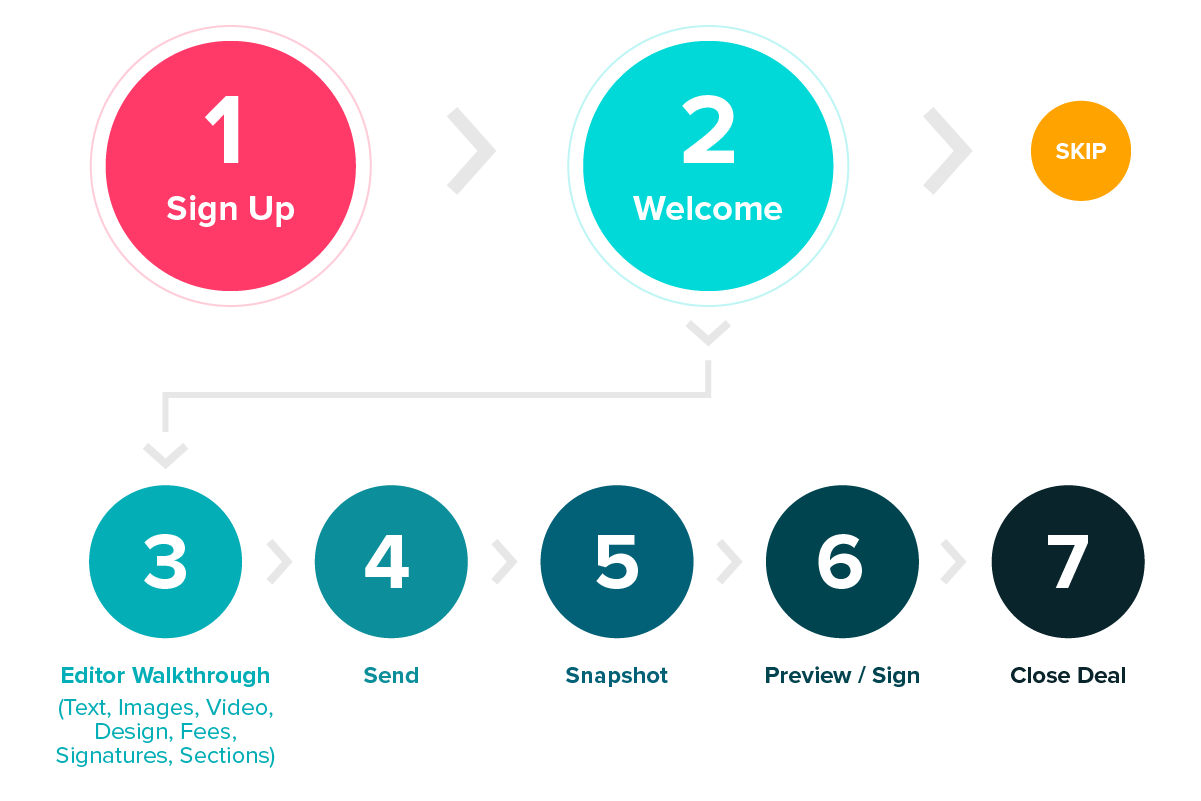
In a nutshell, we wanted to offer a guided tour of the entire workflow of using Proposify to close a deal — from adding text, images, fees, and signatures, to sending, reviewing metrics, signing, and closing the deal.
We wanted to do it in a way so the user wasn’t afraid to progress through the tour because they were worried the test proposal might be sent to a real client or it would skew their pipeline and metrics later on.
We were very careful to not introduce too much detail. Features like team metrics and integrations didn’t need to be communicated during the tour as those are value-add features that improve the product experience over time. Instead, we wanted to get the user to the “aha” moment of what it feels like to close a deal using our product — without the effort and time needed to close one for real.
I made an interactive prototype in Invision to communicate the basic idea and flow to our team. You can see the original prototype here.
The sample template
As mentioned already, Canva gave us the idea of adding instructions to the proposal template itself.
This allowed us to place animated gifs of using the interface in the document and, more importantly, it keeps users focused on how to use the software instead of getting distracted by the contents of the proposal itself.

The final design
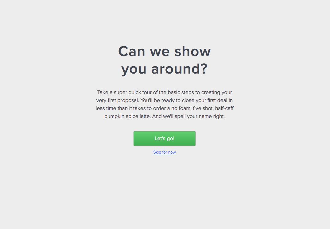
The first thing we do after a user signs up to a new trial is to invite them to take a walkthrough of the product, making it clear they can skip it for now and come back to it later.
The “you successfully created an account” screen with a big CTA for beginning onboarding.
Aside: After looking at it with a fresh pair of eyes, I think we should tweak the messaging to reinforce that the user did sign up for a trial. A little pat on the back to acknowledge their accomplishment can go a long way.
Next, we make it clear to the user that we’re using a sample template to start, without showing them our vast gallery of proposal templates. We don’t want users to get distracted at this point with, “What template should I choose?”. We want to show them how to use the tool to close deals.
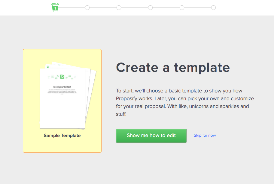
If the user decides to skip the tutorial, we take them to the empty pipeline and then they can create a new proposal and/or choose a template from our gallery. But we always include a reminder for them to finish the tour.

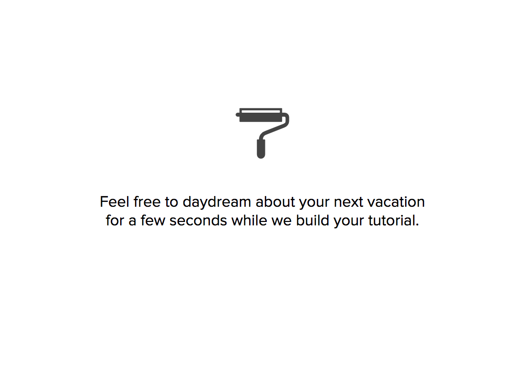
After the user clicks the green button, we import the sample template and show them a friendly message while they wait for it to load.
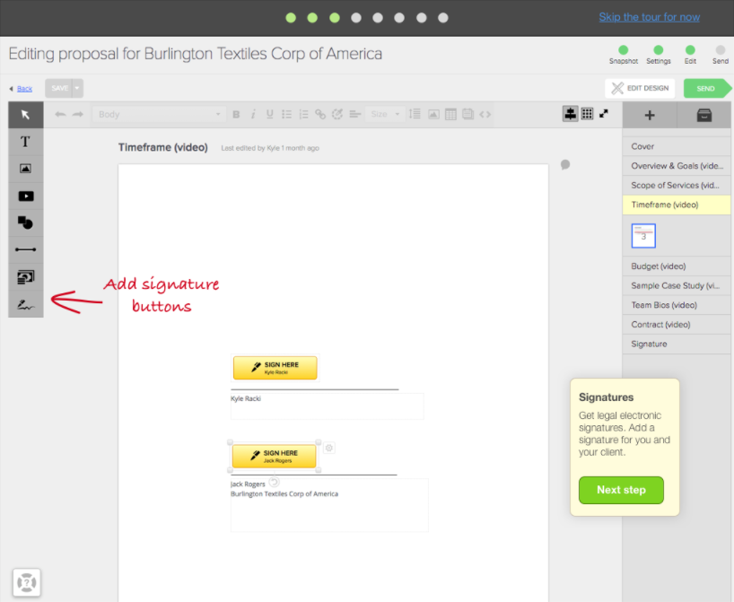
Next, we jump into the editing tour. This is where we show people the basics of using Proposify’s editor for customizing text, images, shapes, and videos.
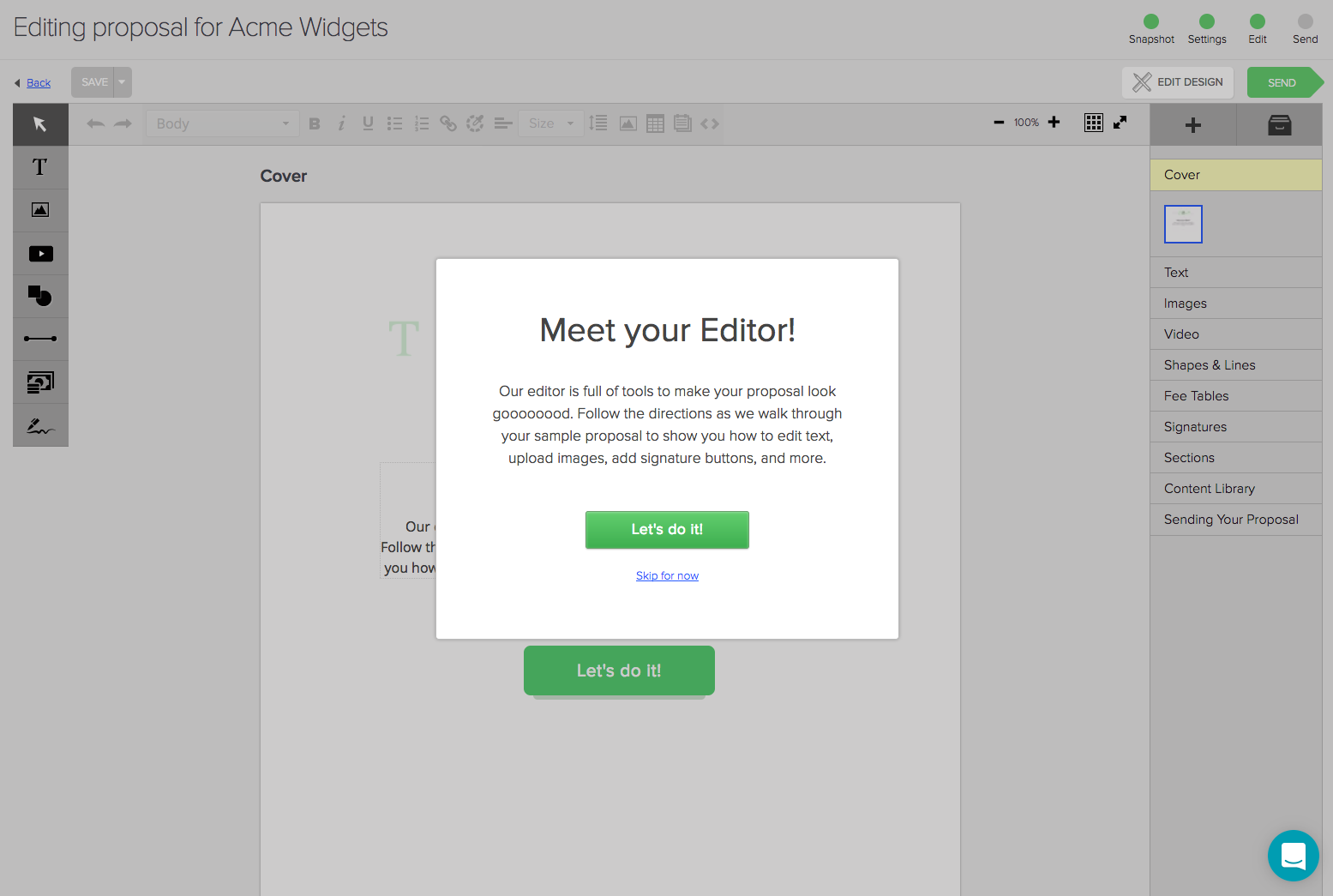
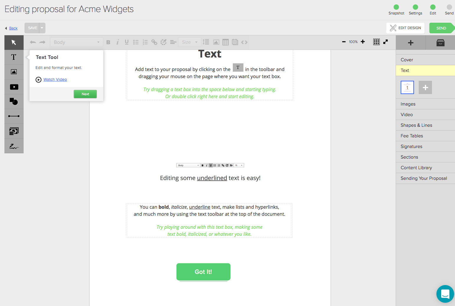
We include animated gifs showing the interface being used in case people are stuck and don’t know how to use a feature.
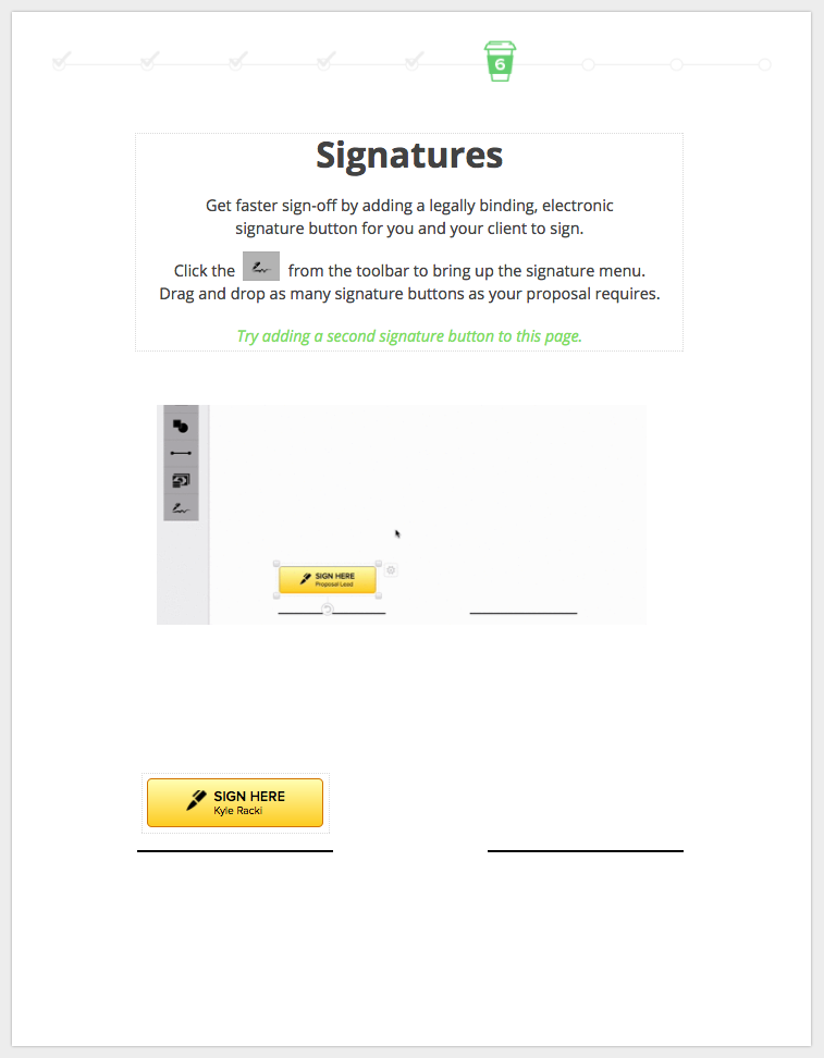
Based on very basic questions that our support team receives frequently, (“How do I add a signature?”) we knew we needed to make it clear how to use two of the most important features in the editor — fee tables and signatures.
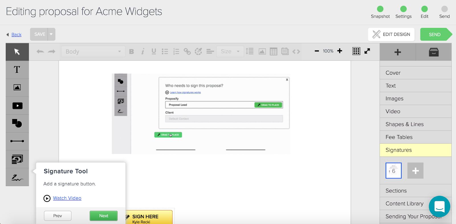
Every feature includes a short how-to video, saving the user from having to scour our knowledge base for answers.
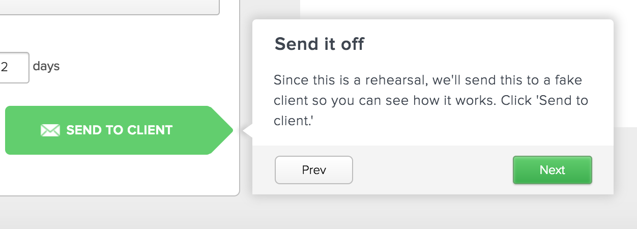
Once the user has had a chance to mess about in the editor and learn the basics, we send them to the most important stage — sending the proposal!
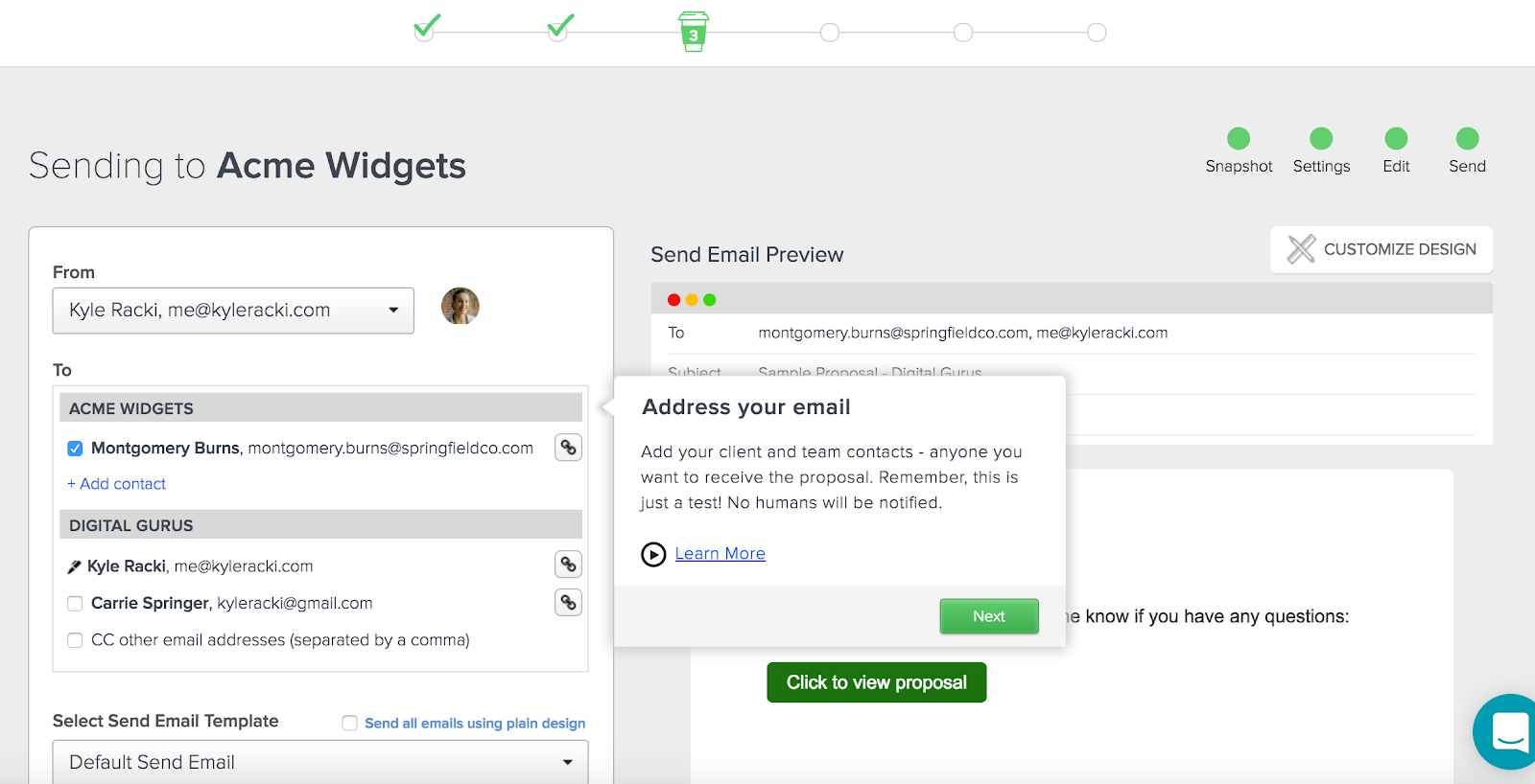
Here we show the user the send screen where they craft the email to their ‘client’, making it clear that this is only a test and no human will ever receive this proposal.
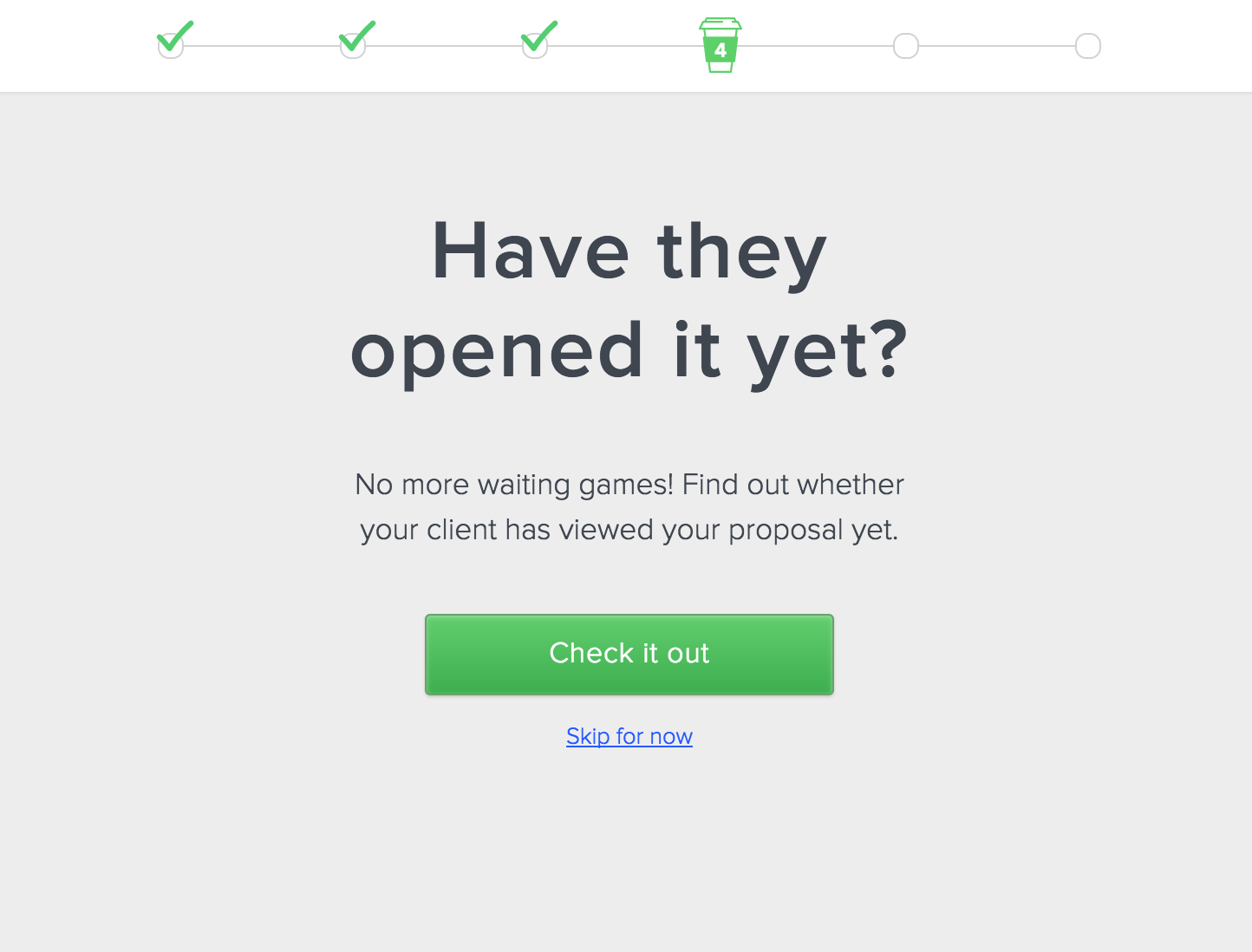
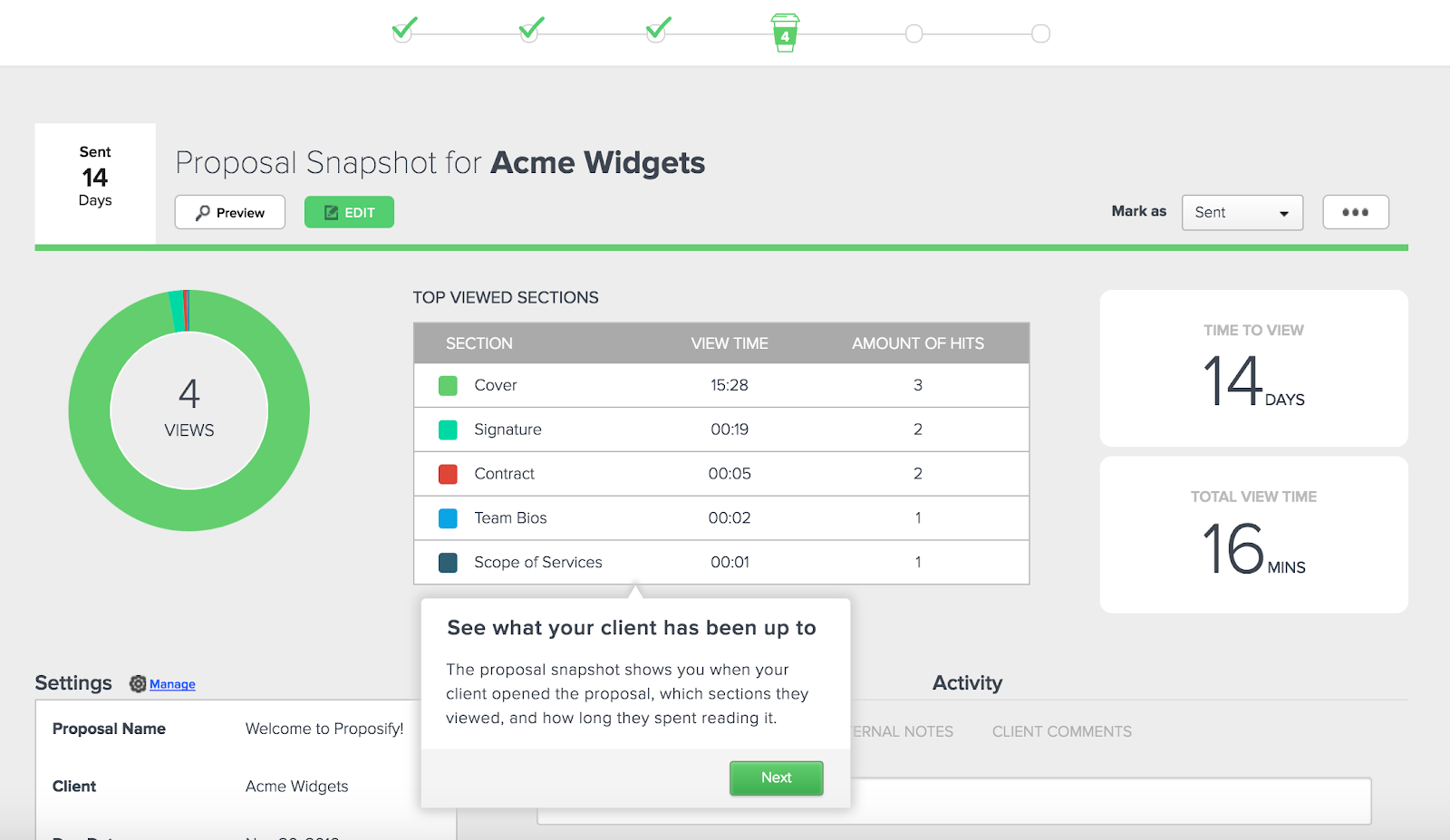
After the user sends the test proposal, we introduce them to the snapshot where they get to see the activity on the proposal and some fake metrics of what the ‘client’ viewed.
When the user hits ‘next’, they see that they need to sign the proposal.
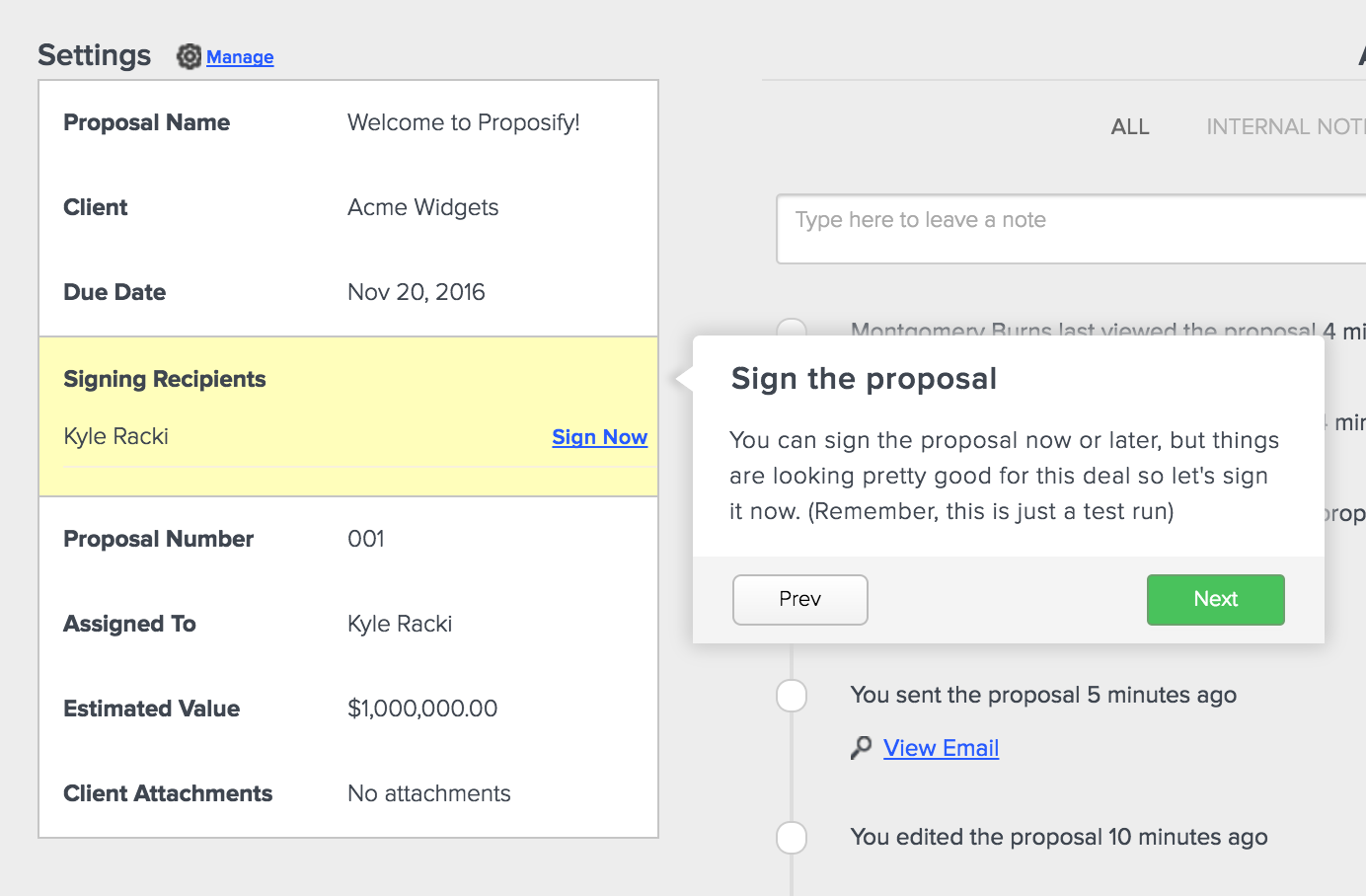
Our support team is often asked what the end proposal looks like from the client perspective, so the onboarding process affords us an opportunity to show them just that.
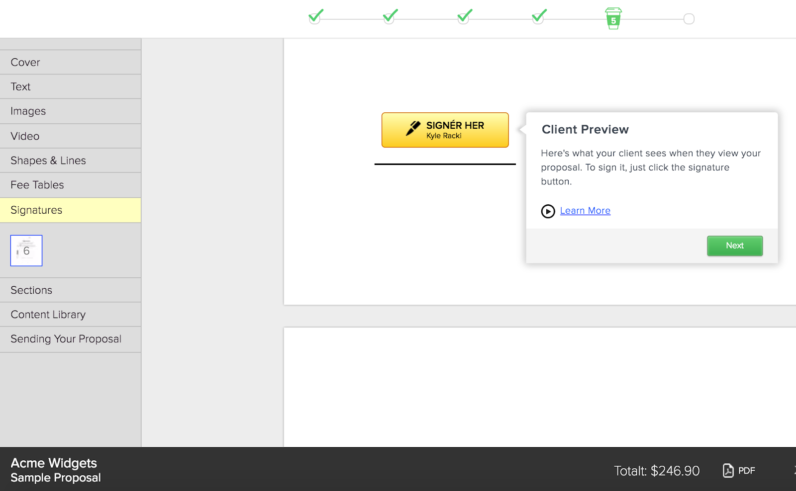
The user also gets to experience firsthand what the proposal sign-off experience is like for clients.
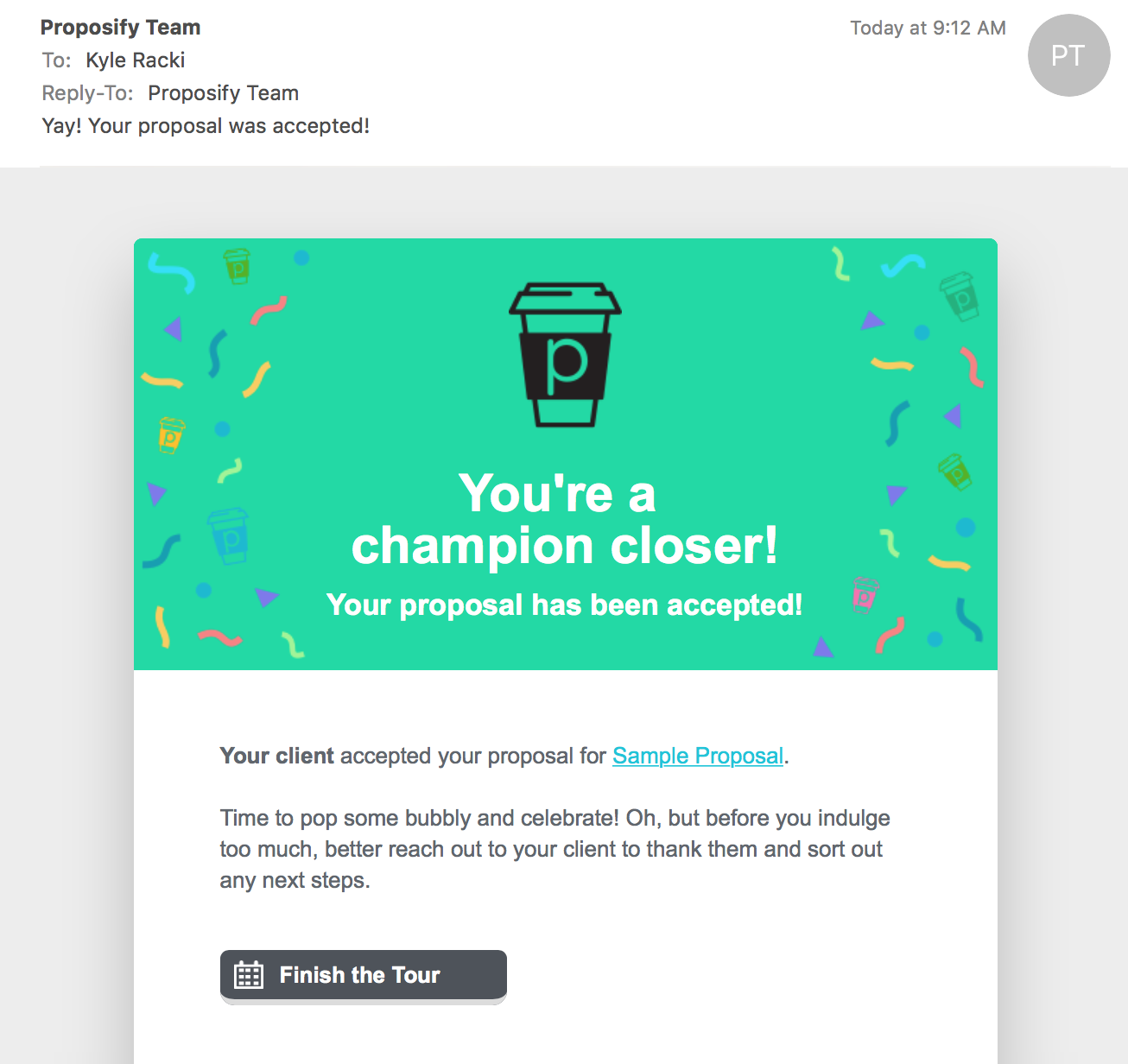
After the proposal is signed we ask users to check their email. When they do, they’re greeted with our ‘accepted’ email. This is it, the holy grail of what users want from our product!
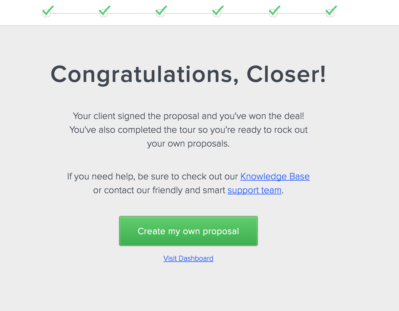
Finally, once they click the “Finish the Tour” button, they’ve completed the onboarding process and are considered “active”.
Now that they have a bird’s-eye-view of how the software works, they can start working on their real proposal.
An important thing to point out is that we’ve now made this onboarding process part of everyone’s first time experience, whether you’re the one who signed up for a Proposify account or you were added as a user by the account owner, like a manager or co-worker. We realized that by only onboarding the account owners, we were missing out. We needed to onboard ALL of our users.
Using emails more effectively
Using email to nurture new users as they begin to learn your product is an important element of onboarding, and we weren’t doing it as well as we could have.
For starters, we weren’t targeting our emails based on whether or not someone was actively using the product. There was no activation metric we could use to say, “This person is on their way to becoming a customer” or, “This person signed up and gave up quickly”.
We read blog posts about how to use email onboarding more effectively, empowering new users to get more value out of the product and sending targeted emails based on their behavior while using the product.
Groove published a great blog post on email onboarding that helped us develop our own workflow to send relevant emails to users based on whether they were active (completed the walkthrough) or inactive (didn’t send a proposal or complete the walkthrough).
Once we had the general email strategy mapped out we re-wrote and designed every email.
The second thing we changed was the tool for sending onboarding emails. In the past we custom-coded every email ourselves and used CRON jobs to send them out.
But this didn’t work well because often those of us on the product and marketing teams need to tweak emails, either the content or when they are sent, without needing to wait for developers to push the changes live. So we began using Intercom’s smart campaigns feature to send the emails.
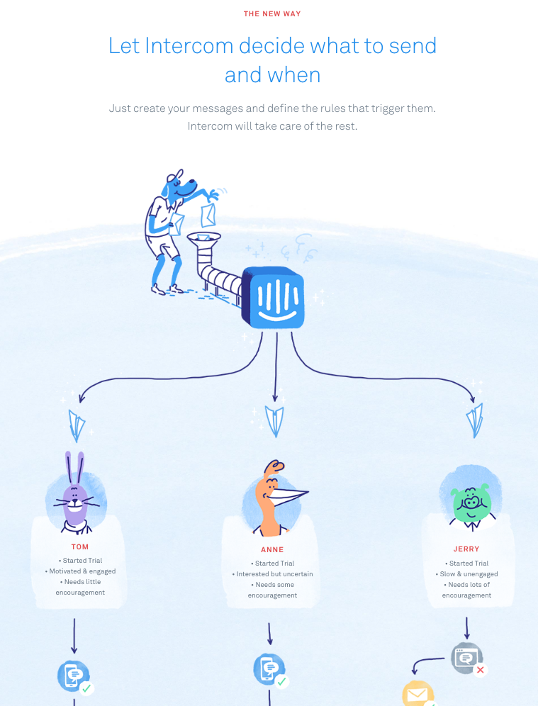
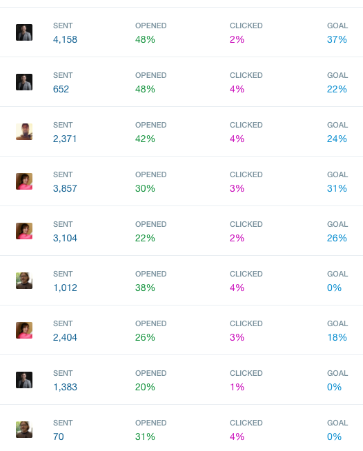
Now our non-engineers are empowered to review and change the onboarding emails themselves, and we can see more clearly how many emails are being sent, opened, and clicked.
Here’s how the final onboarding campaign looks in Intercom:
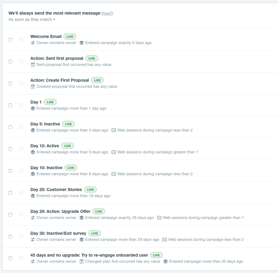
Now our in-app onboarding and email onboarding work together to guide new users to become active — by recreating the experience of winning a proposal using our product — and the emails send unique messages to users based on whether or not they’ve become active.
Testing
Because it’s so important that we nail the onboarding process and don’t lower new trial conversion, we were very careful, even more so than normal, and we went through three levels of testing.
First, we performed QA testing in our standard process, led by the wonderful Janani, our team’s eagle-eyed QA analyst.
Then, we tested it out ourselves internally and showed our spouses, partners, and friends.
Finally, we sent it out to UserTesting.com and had some complete strangers walk through the onboarding, speaking their thoughts aloud.
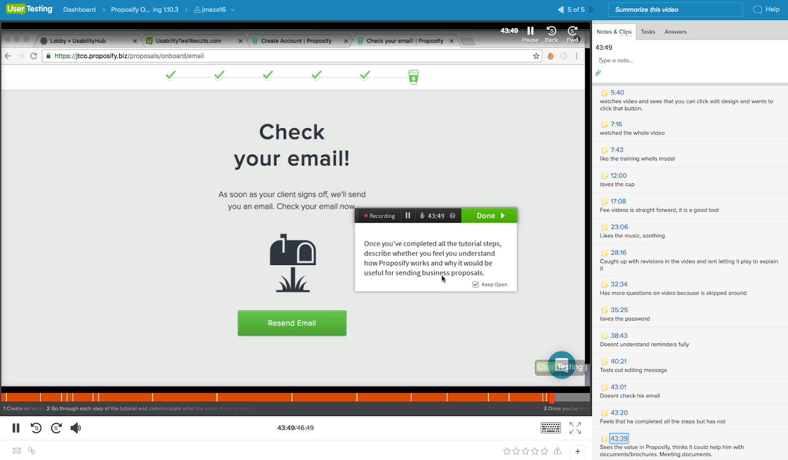
By testing it on five subjects, we realized that the last step of checking email was confusing to most people, so we added a secondary button to complete the tutorial.
The results
It’s hard to tell at this point how successful the new onboarding is since we only launched it about a month ago. Likely we’ll need a few months of data to determine whether or not it was a big win.
Still, the signs are promising.
We’re carefully measuring each step in the onboarding tutorial to see if there are any big drop off points where users abandon it.
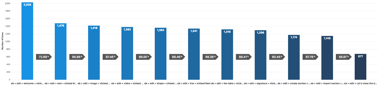
As you can see, there are a lot more steps to this onboarding process than the old one, so more chances for users to drop off.
But our bet is that anyone who does complete this process is going to have a much better understanding of what Proposify can do for them and feel confident that they can successfully use the product to close more deals.
The core metric we’re using to judge the success of our new onboarding is conversion-to-paid, which is the percentage of users who begin a trial and then upgrade to a paid account.
As of Dec 1st, our trial to paid conversion has gone up slightly (about 5% increase) but it’s hard to judge whether or not it was a home run until we collect more data.
We already know that users who send a proposal during their trial are 2x more likely to convert to a paid account.
And what we’re finding is that a user who completes our new tutorial is 3x more likely to send a proposal, and those who complete it are 7x more likely to become a paying customer. That could be an anomaly, but we’re keeping a close eye on it to see if this process moves the needle.
Conclusion
Hopefully this indepth walk through of our thinking and processes behind the onboarding revamp has inspired you to rethink parts of your own onboarding, whether it’s a service or a product.
To recap, the key takeaways are:
- Looking at our metrics we saw that conversion to paid was our one core metric that we needed to improve.
- We gathered qualitative data from customer conversations and support tickets and realized that some new signups weren’t getting the big picture of how the product can be beneficial and giving up too early, while those who became customers experienced some sort of early success using the product (either by sending or winning a proposal).
- We hypothesized that an online walkthrough would give the user a feeling of accomplishment, combined with targeted emails nudging them to complete the tutorial.
- We invested time reading blogs on onboarding and trying out other SaaS products to learn from what they’re doing and gain inspiration.
- We made informed decisions on which external tools we were going to use and not use. We decided to build the tutorial ourselves but outsource the email targeting through Intercom rather than build our own.
- We tested the new onboarding process out on real users and looked at data early on to see if there were any major roadblocks.
If you're an existing Proposify user and you want to check out our new onboarding tutorial, sign in to your account, choose Resources, then Guides, then click "Take the Tutorial". If you're not already a user, why not sign up now for a free 30 day trial?
Listen to a podcast about our new onboarding process
Our latest podcast is a conversation between me, our product manager Ricky Ferris, and our growth marketer Patrick Edmonds about the important role onboarding plays in developing SaaS products or services, and we go into more detail about the behind-the-scenes process of Proposify's new user onboarding. Listen now!
Subscribe to this podcast using iTunes.
If you enjoy these kinds of in-depth posts about what we’re trying in our product I’d appreciate a comment letting me know what else you want to learn about.


