


Published: January 23, 2018
Updated: April 11, 2024

Good microcopy can improve customer retention and increase conversion rates. However, marketers, writers, developers, and designers each approach microcopy differently, because they have varying ideas of what “copy” is and how it fits into their tasks. This can lead to confusing or misused microcopy, which is the exact opposite of what it’s supposed to do.
If you’re looking for tips on how to approach microcopy differently from other types of copy, how to avoid misusing it, and how to create eye-catching microcopy that enhances your UX, read on.
What is microcopy?
Think of when you’ve visited a company's website for the first time. Chances are you went there in search of something specific – contact information, a product, or perhaps a service.
You may have looked for words to help you navigate the site. Things like page descriptions, form labels, instructional tooltips, button text, error messages, and on-boarding copy. All of those magical bits of text are called "microcopy," and their purpose is to increase understanding between a product and its users.
Why microcopy is different from other copy
While it is still a form of copy, and one you want your customers or users to take notice of, microcopy differs from other copy that lives on your website, app, or product.
Regular copy might include your company’s missions, values, goals, or information about who you are. Microcopy, on the other hand, is geared toward helping the user of your product or website understand how to navigate and use different elements or features. Because of this, microcopy needs to be more straightforward than other copy, and should always have the user in mind.
Show, don’t tell
Product microcopy should use a filmmaker’s philosophy of “show, don’t tell,” since most products are a visual medium. It should enhance user experience (UX), not compensate for bad design.
For example, rather than including microcopy that says “click the button to the right,” design your page so it’s clear to the user how to navigate your app or website. There’s no need to use words to describe what should be obvious to the user.
If your microcopy is clear, users should be able to easily maneuver your product or website. On the flip side, if it’s being used to explain what isn’t immediately apparent, chances are you have a design problem. Work on that first, THEN tackle your microcopy.
Avoid jargon in your product microcopy
Good microcopy is clear, concise, and free of jargon that your average user might not understand. Your product copywriter, UX copywriter, sales copywriter, and marketing team probably know all the special words you use internally; your users may not.
For example, your team may use words like “modal window,” “input,” or “tooltip,” but the average user may have no idea what those things are, or what they mean in the context of your product.
By avoiding jargon in your microcopy, you’ll avoid any confusion your users might have while using your product.
Alleviate fears
When people aren’t familiar with your product, they may fear what could happen when they click a button that does not have clear instructions or directions on what will happen next. Your goal is to eliminate that fear with your microcopy.
For example, when preparing to email a proposal to a client, if a user sees a button that says, “Send”, they may worry that it will go out before they’ve had an opportunity to compose the email, when actually it takes you to the send review page. Using microcopy that says “Next" or “Compose email” clarifies the following action and relieves any fears.
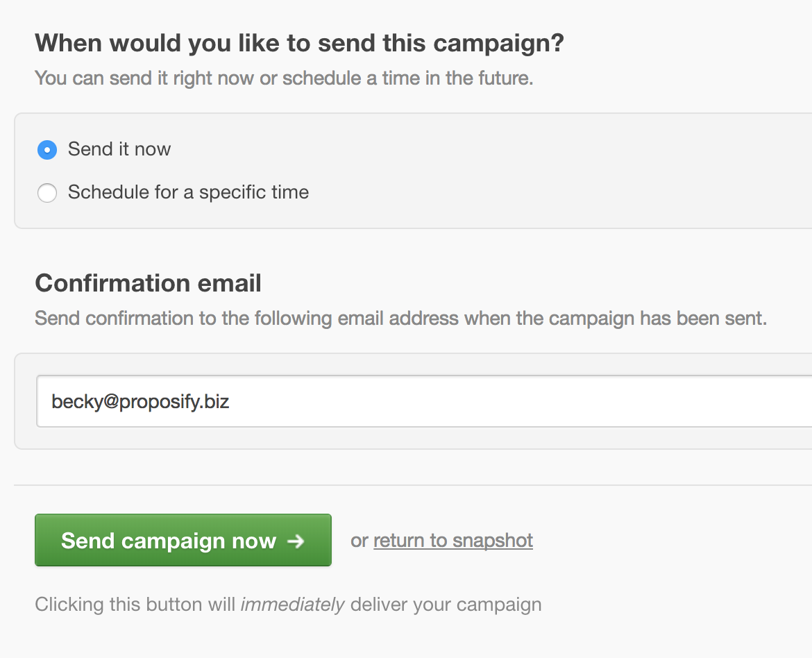
Notice how Campaign Monitor makes their sending system clear with a big green button that says, “Send campaign now,” stating that by clicking it, it will send your email campaign. There’s even small copy below to drive home the point.
Another example is when you’ve hit your usage limits, and it’s time to upgrade your account. Instead of a button saying “Upgrade now” you should instead use “See plans and pricing” so the user knows their card isn’t going to be immediately charged some unknown amount.
Focus on the context
As mentioned before, the purpose of microcopy is to enhance the user’s experience with your website or app and should work in conjunction with your User Interface (UI). It’s not there to sell; that can be achieved with your advertising, landing page, or feature tour. Your UI should be the star, with good microcopy supporting it.
For clear, concise microcopy, focus on the context – the where, why, and what.
Where
Microcopy can be used in various areas of your website or product to make it easier for users to navigate, which will also make your product more inviting.
That said, you don’t want to add microcopy to so many places that it irritates your users or have it serve as a plug for holes in your design. Your microcopy should explain to a user where they are in your interface, and allow them to figure out where they want to go next.

Why
So you’ve provided your users with microcopy that explains where they are in your product or page, but people like to be in the know. They want to know the purpose behind each step they’re taking to meet their end-goal.
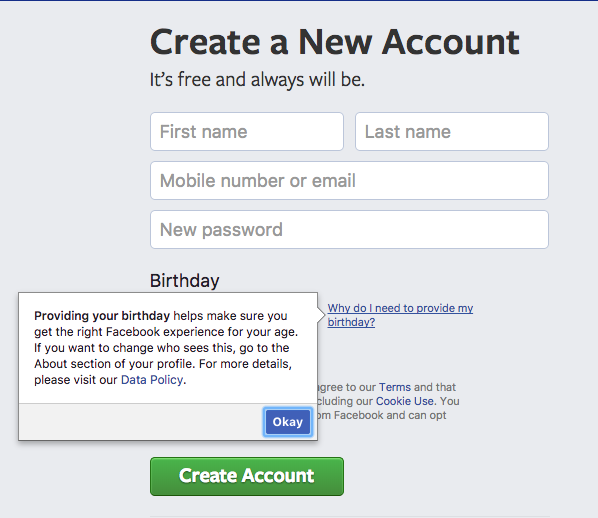
For example, when you’re creating a new account with Facebook, they ask you to provide your date of birth. Some people may question why they need to provide personal information like this to gain access to a website, so this is a great opportunity to use microcopy to explain why.
Explaining different steps to your user can eliminate frustration and confusion, and can lead to a better experience with your product.
What
Now that your users know where they are in your product, and why they are being taken through different steps, you need to explain what they can/should do next.
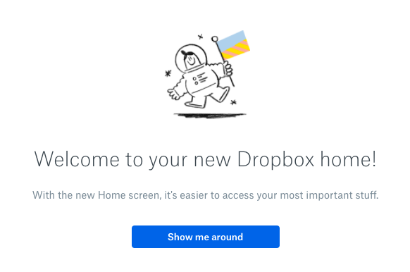
This is where you can get your user excited about all the features you provide and ensure they are comfortable using your website or app. Dropbox does a great job of this by explaining the names of different features, and what the user can do with each one.

Keep it light, but not too light
While you can reinforce your brand with snappy microcopy, it should be kept to a minimum.
Jokes are great for showing off your brand’s personality but use them sparingly and in the right context. If a customer sees an error screen, gets a blank screen after they search for something, or are confused while being on-boarded, the last thing they want to read is a quippy joke that makes it seem like the product is laughing at them.
Slack does an excellent job of keeping their microcopy on-brand with light humour at the appropriate time.
Keep any error messages sincere, and save messaging that shows off your personality for other areas of your product.
Keep your product microcopy short
People read a fraction of what you write in a product. Why? Because time is money. Whatever you write, cut it in half.
People don’t want to spend precious minutes sifting through every page of your website to find a small detail that will answer their question. As an exercise, pretend you’re writing copy for a tweet or a billboard, platforms that require you to keep your thoughts concise, yet effective.
For product microcopy, ask yourself, “Is this helping someone?”. If the answer is no, then leave it out.
Deliver a massive punch with micro copywriting
Microcopy may be teeny tiny bits of copy, but those bits of copy can deliver a punch when done well. It can boost your customer retention and conversion rates, which is always a plus.
To create killer microcopy that matches your website, product, or app, write as you go through an interactive prototype, rather than in a spreadsheet or Word document. As the writer, it will help you understand the context of where the user will be, why they need to do something, and where they need to go next.
If you keep your language clear, concise, and free of jargon, you’ll have microcopy that can KO any confusion among your users.


![The 3 Ws (& 1 Big H) of Using Humour in Business [With Examples]](https://www.proposify.com/hs-fs/hubfs/Imported_Blog_Media/blog-2021-02-16-humour_in_business-Apr-09-2024-05-58-53-9365-PM.png?width=450&height=250&name=blog-2021-02-16-humour_in_business-Apr-09-2024-05-58-53-9365-PM.png)