Agency Website Do's and Don'ts: Are You Making These Design Mistakes?
Published: February 28, 2017Updated: December 20, 2024

Even great agencies, ones who do smart work for their clients, sometimes have the worst websites. It seems to be a classic case of “the cobbler’s kids have no shoes.” Too often agencies don’t practice what they preach to their clients, instead putting up bland, generic websites that never get optimized for conversion and are rarely updated. We review the best and worst of agency website design so you can atone for your online sins.
The thing is, the cobbler's customers (Do cobblers exist anymore? Perhaps a subject for a future blog post.) will probably never see whether his children are wearing Nikes or flip flops. Unfortunately for you, your potential clients will look at your website, and it could be the deciding factor in whether or not you get their business. If you’re a design or marketing agency, your website is your best chance to make a first and lasting impression with your audience.
We’ve previously poked fun at the way some agencies market themselves, but here are six reasons many agency websites suck, how they can be fixed, and examples of some of the best.
1. Don’t ignore landing page best practices
Believe it or not, your agency website is meant to generate business leads. In my experience, some agencies have a superiority complex where they don’t want to appear too eager for work, as if being hungry for business means they’ll look desperate. Weird, right? As a result, they don’t place any clear calls to action on their site.
There’s nothing wrong with communicating the fact that you want more clients, this just makes you seem like a growing agency who wants new business instead of an aloof ‘too-cool-for-school’ agency that’s at max capacity and doesn’t want to be bothered.
With that in mind, take a dose of the medicine you give to your clients and follow best practices for landing page optimization on your own website.
No clear call to action
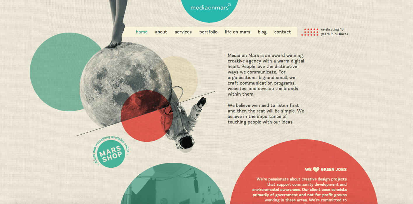
This homepage from Media on Mars looks kind of cool but there’s no clear headline about who they are or what they do - it’s waaaaaaay too busy. They need to communicate quickly who they are, what they do, and why you should care.
Splash pages with sound
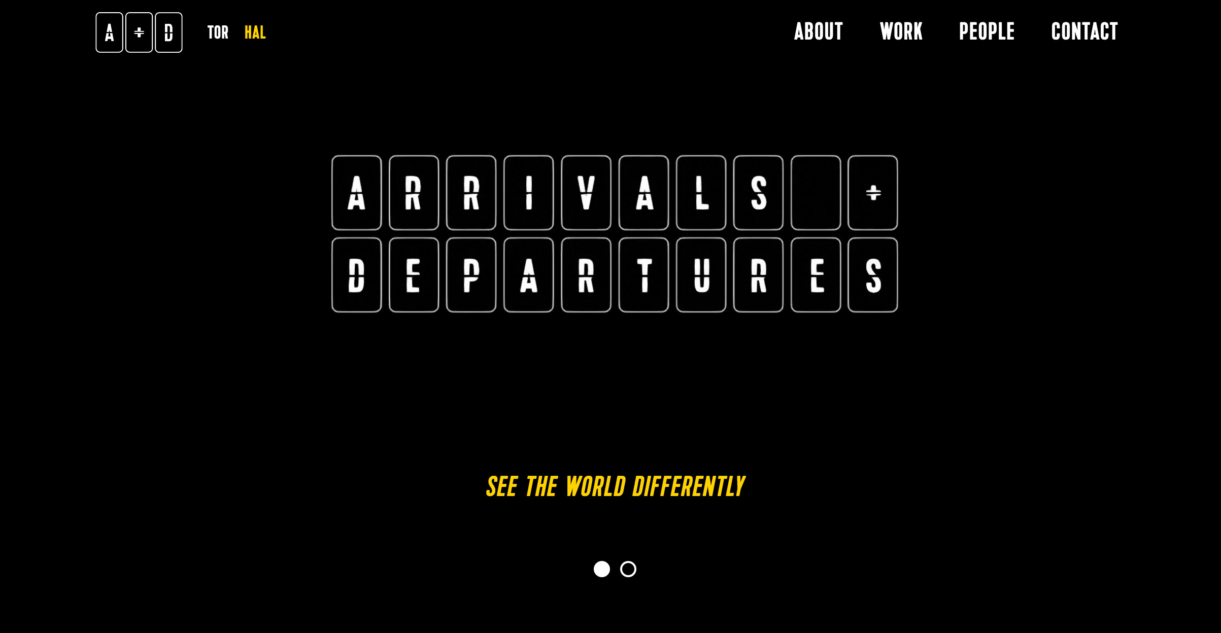
This site from agency Arrivals and Departures is super old school but not in the good way and it was just launched a few months ago. A Flash-like splash page with loud noises - ugh. It assaults the viewer and it’s still unclear who they are or what they do.
Trying too hard to be clever
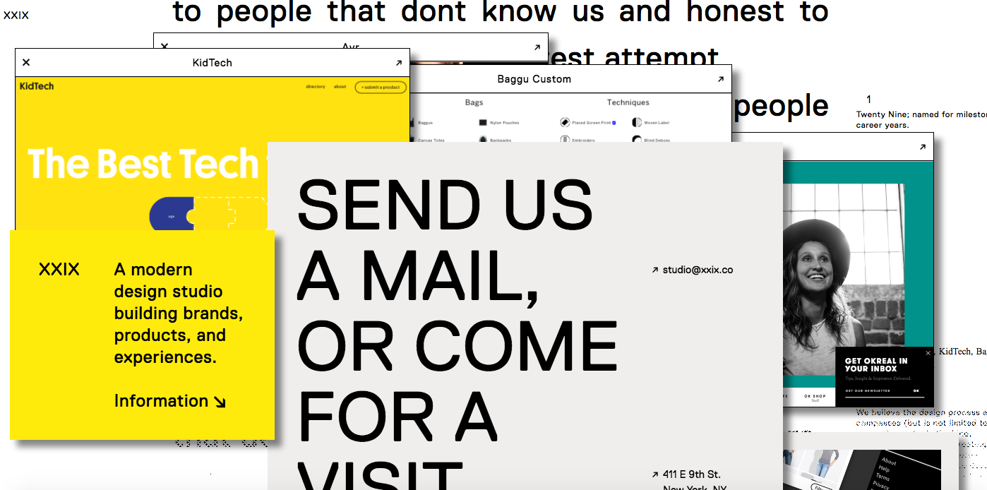
So many agency websites suffer from this affliction of trying to be too clever. First of all, what is the name of this agency? Do I call it literally X-X-I-X, or are those Roman numerals? Naming is a post for another day but already I’m confused.
There is SO MUCH going on here with chunks of text, blocks moving around, even my cursor keeps changing for some reason. I have no idea where to look or what they want to tell me. In their attempts of trying to be interesting visually, they ended up with confusing navigation and no clear hierarchy.
Confusing navigation
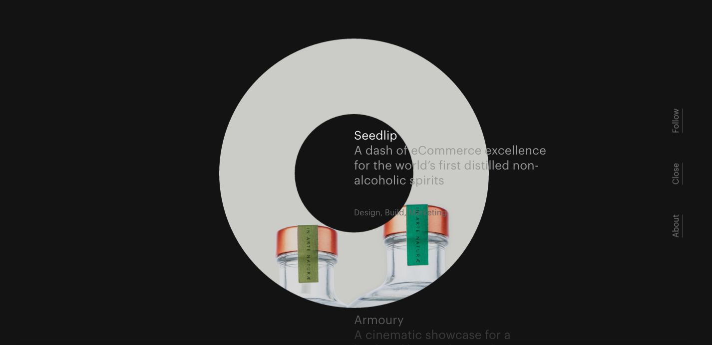
This website from Rotate looks slick at first glance but again, there’s no compelling call to action or information. A worse crime they commit is that it’s very hard to see where the menu is, and once you try to start navigating around the site, you get lost. It’s not intuitive at all. Don’t make your users work to find out about you.
Here are a couple of sites doing it right:
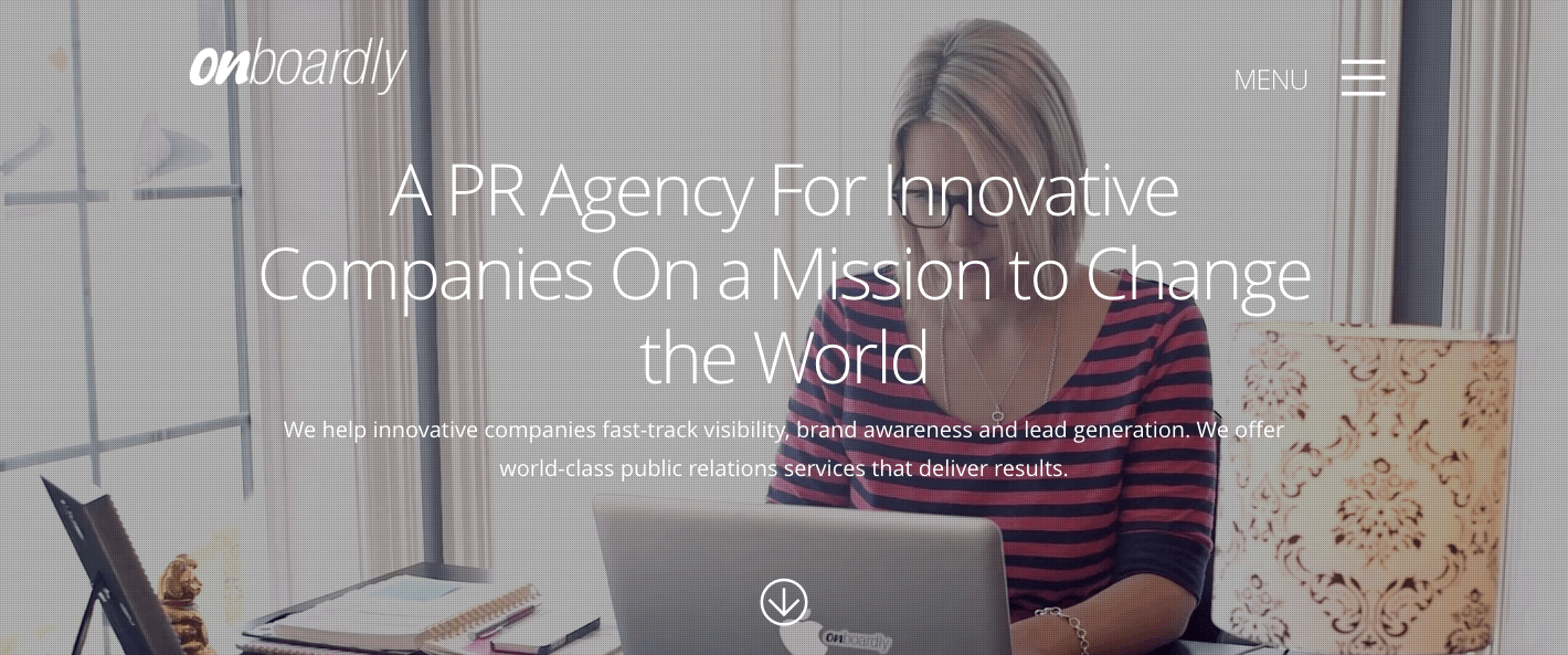
Onboardly is a great example of a site where you understand immediately who they are, what they do, and who they can help. They’ve researched their target client (in this case startups and tech companies), they understand their pain points (public relations and brand awareness), and they wrote content that addresses both those things specifically.
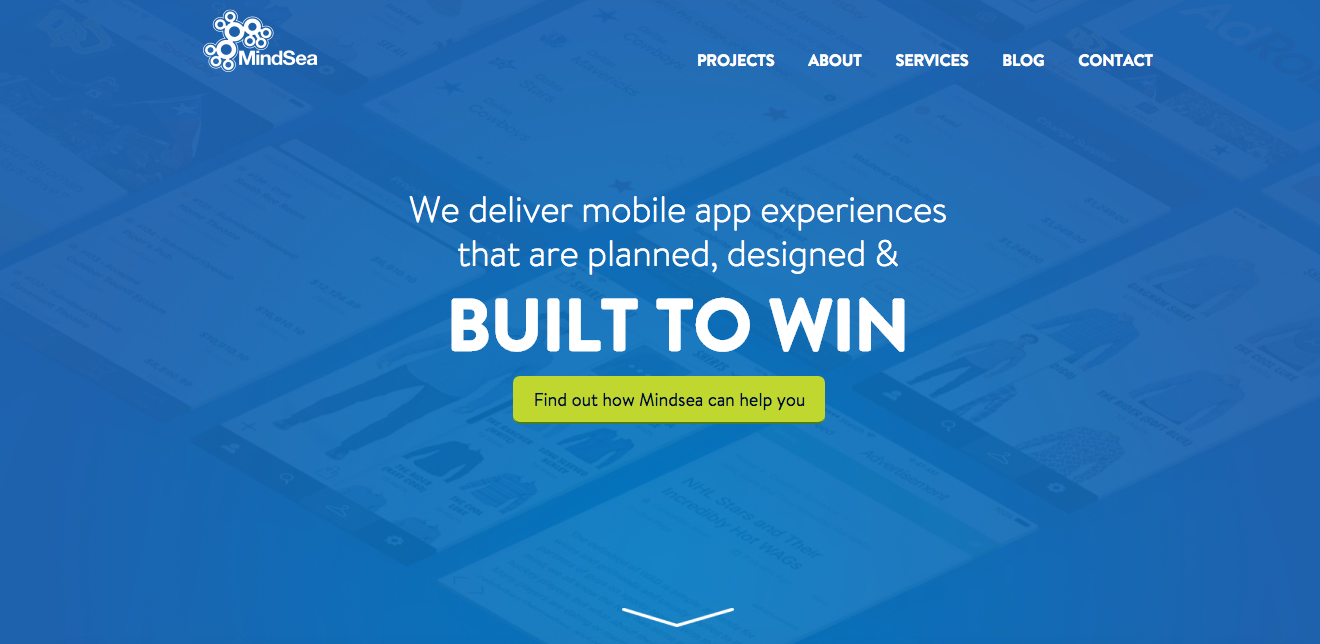
MindSea is another company with a smart, to the point homepage. You know instantly that they are a mobile app development company (who also helped us develop the Proposify mobile app, BTW) and as you move through their site, all the copy addresses the pain points of their target clients.
It’s a wise idea to use optimization tools like VWO to continually test and configure your website headlines and calls-to-action (once you have them!). We do that regularly here at Proposify and it debunks a lot of assumptions we sometimes make about what might or might not work.
2. Don’t miss an opportunity to engage with people.
Unlike product landing pages where you’re looking to convert as many customers as possible, an agency is not a volume business so you don’t necessarily want every lead who walks through the door. That means a simple conversion rate (percentage of unique visitors who contact you) isn’t the be-all-end-all of your agency’s website goals.
However, just because a user isn’t a lead right now doesn’t mean that you shouldn’t take the opportunity to connect with them. Content marketing (your blog, lead magnet, or helpful e-book) is a great way to build up your reputation as a knowledgeable expert.
Gathering inbound leads who read your content is a more measurable way of gauging your effectiveness because you can keep pushing out content to those fans who in turn share it with others. Down the road, that could turn into a valuable business referral.
Two sites that do this well we looked at in the last point:
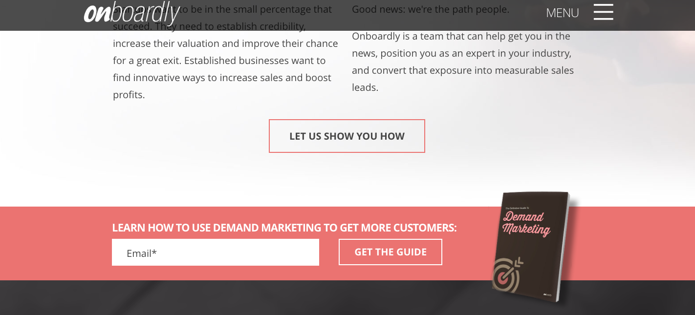
Onboardly offers a free guide to demand marketing, which addresses a pain point they know their website visitors are looking to solve. It’s free in exchange for an email address, allowing both the user to sample Onboardly’s expertise before committing, and providing Onboardly with a warm lead they can follow up on.
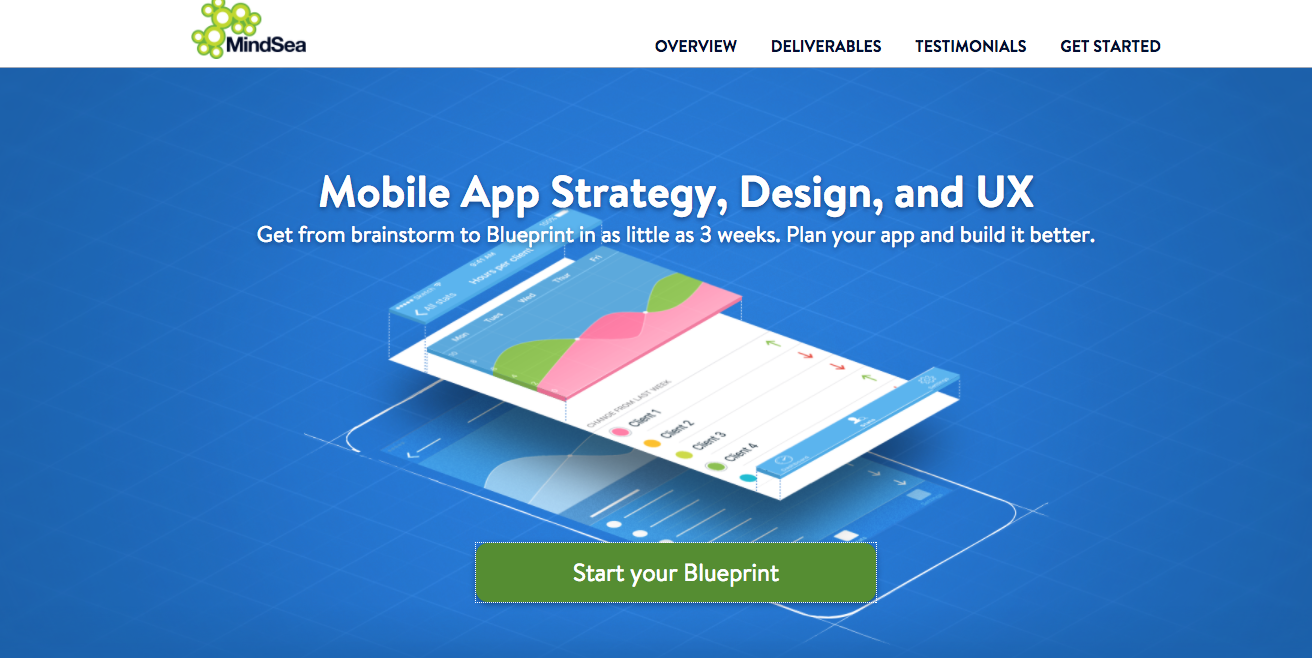
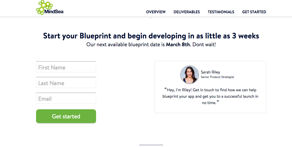
MindSea offers a few lead magnets but I also like their foot-in-the-door (FITD) offer through their Blueprint program. As opposed to lead magnets that are usually free, foot-in-the-door offers are generally small, paid projects. They allow a client to sample what it’s like to work with you and see the results before committing to a larger and more expensive project.
Offer a free lead magnet, a foot-in-the door offer, or some other kind of supplemental value to your website visitors so in return you can gather email addresses or other information to follow up on.
3. Don’t write bland or self-indulgent copy
Many agencies fall into the trap of either sounding too generic:
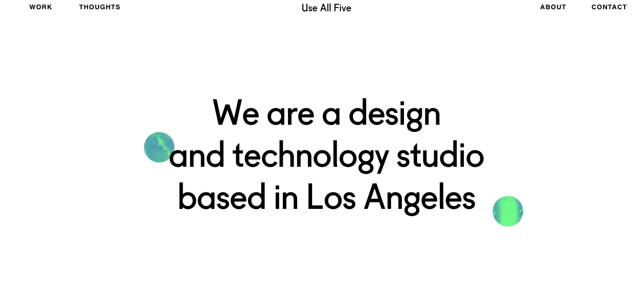
OK, so? And are you only looking to work with clients in LA? There’s a fine line between being simple and clear, and being boring and not saying anything.
Or too pretentious:
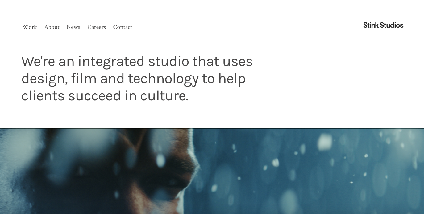
What does “succeed in culture” mean? If I’m a client looking for agency help, do you think I understand that my pain point is “to succeed in culture”?
Either way, neither of those types of headlines directly addresses the real reason a potential client visits your website. The reason they come to your website is that they have a problem and they need someone to solve it for them.
The best agencies write copy that walks a fine line between addressing their clients’ pain points while reflecting the personality of the team and telling their story, without sounding too self-obsessed.
It helps when you know exactly who your ideal client is and the size of their organization. In small companies and startups, you’ll be working with the founder who is spending their precious working capital to grow their business.
In larger organizations, you’re probably going to be speaking to a marketing manager or another employee of the company who is tasked with hiring an outside firm. They are concerned with looking good to their bosses and minimizing risk to their job. Your language should cater to one group or the other.
It’s even better if you sell to a specific industry vertical, that way your language is even more targeted to the goals of your ideal customer.
This site from our friends at Industrial Strength Marketing is a great example of this.

Immediately you know what they do and who they do it for thanks to image and copy. They cleverly use copy that has an industrial feel to it to describe what they do.
4. Don’t design a cookie cutter website.
A lot of agency websites look the same. Dark background, large images, reverse text.
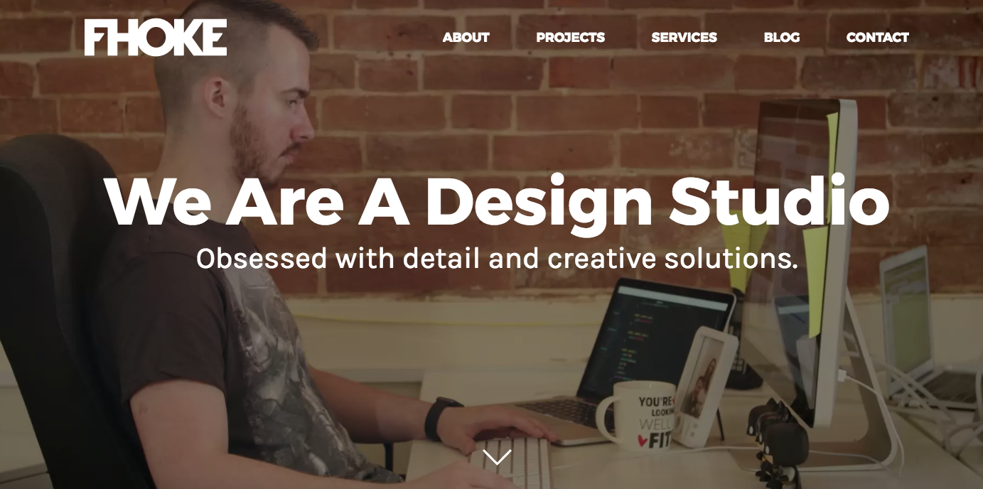
This site from FHOKE is really nice, with a clean design but it looks like a lot of other websites.
There’s nothing wrong with that, but the agency websites that really stand out go further and deliver the “wow factor”.
They stand out as different in a group of similar companies and after all, isn’t that what branding is all about? They show more than tell the awesomeness they can bring to new clients.
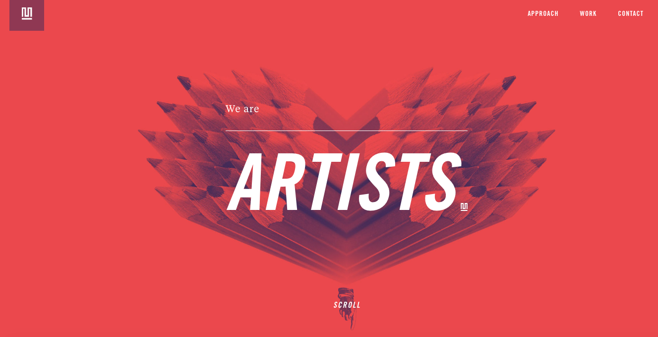
This website from Method Studios stands out to me. The restrained colour palette, the photography, the typography, the images. While they could still use some help with their calls to action, this is visually a very interesting site. For a design studio they are showing, rather than just telling, what they can do.
I remember the time I was at lunch with a group of potential clients who ran a dental clinic. One of them offered me constructive criticism: “You know, your website makes you look very expensive,” as if that was a bad thing. When I thanked her, she appeared puzzled.
Of course I want to attract clients who have real budgets, not ones who are looking for a bargain. Design is a premium service.
When I grocery shop I often find myself noticing the differences in packaging for similar products: the generic no-name brand, the mainstream brand, and the premium, high-end brand. There are choices that the designers of each of those products made to communicate their respective value to consumers.
Cheaper products look cheaper. Expensive products look expensive. Next time you’re at the store look at the differences, and remember that when it comes to your agency, you’re selling the high-end shit, not the no-name brand.
5. Your agency portfolio doesn’t tell your story
Arguably, the most important section of your agency's website is the work section (or portfolio, or whatever you decide to call it). It’s common to see agencies simply posting pretty screenshots of their designs. Trends change quickly though, so if you’re relying on looks alone to sell your work, it’s only going to be effective for so long.
When clients look at your portfolio, they’re window shopping. They’re seeing how you solved problems for past clients and trying to envision whether or not they can trust you to deliver similar results for them.
Visuals alone won’t tell the whole story, although they are very important. More important is walking viewers through the process of how you got to that solution. What were the goals of the project? What big challenge did your team face and how did they overcome it? What was the result?
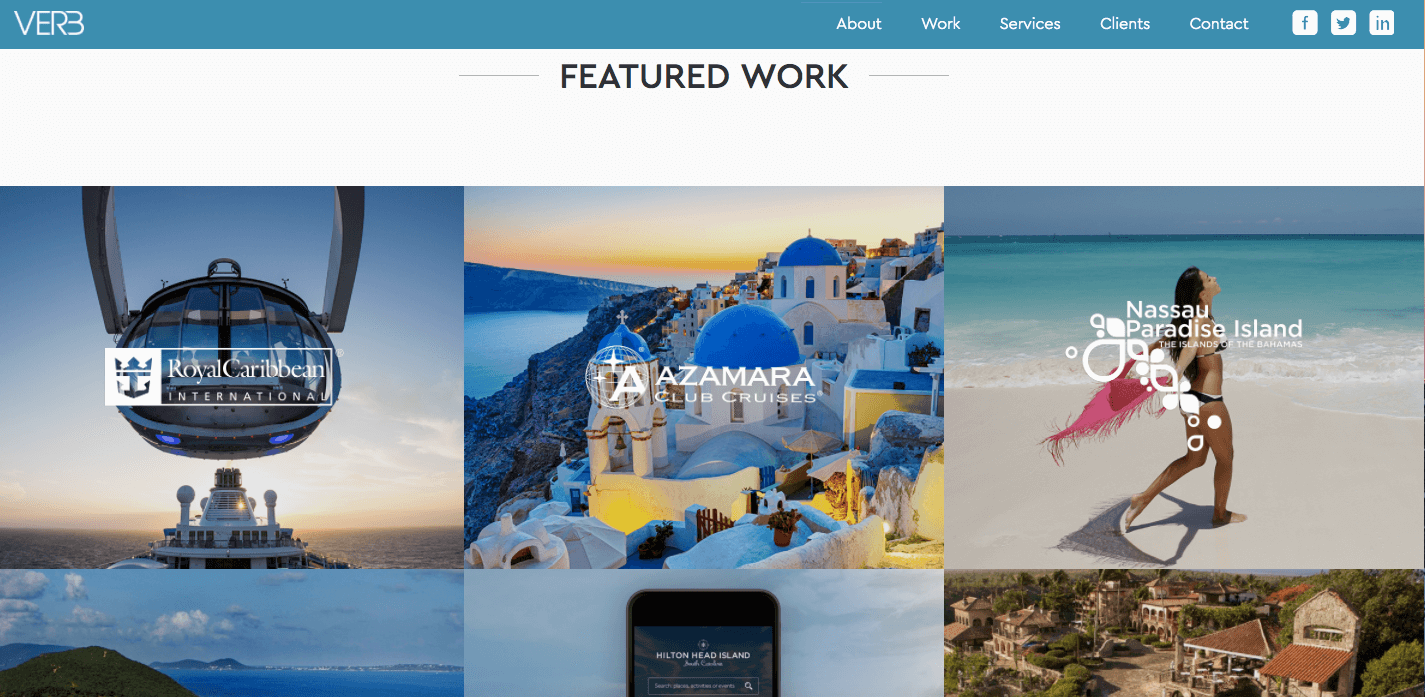
I know the folks at Verb Interactive and I really admire their work. They’re smart and successful, focusing on the travel and tourism industry. Where I don’t think Verb does a great job is with their portfolio. It seems to be just stock photos with client logos overlaid and then when you click on the images it goes straight to the client website. There's no insight into the goal of the project, the approach, or the results.
Personally, I’m a big fan of showing as much of the process as possible so the viewer gets a clear picture of what your agency is like to work with. Show the sketches. Show the failed design comps that didn’t work. Show up-to-date metrics that indicate the tangible results you achieved.
Viget does an incredible job of their portfolio. Each case study is almost its own microsite. It talks about the projects, the approach, the process, the results, taking the viewer through each step. You get a really good sense of what it’s like to work with this agency.
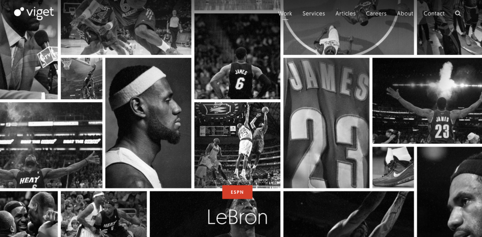
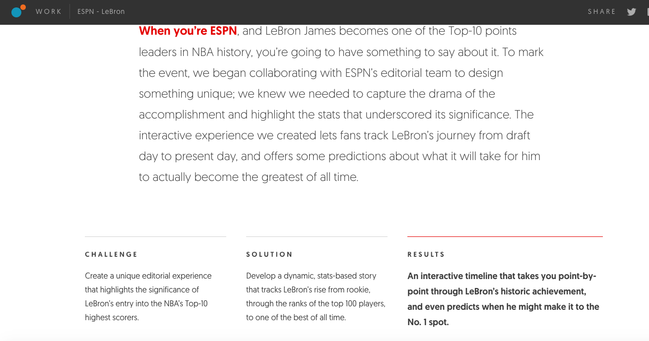
It takes work to add that level of detail, but it’s better to show six killer case studies than twenty mediocre screenshots.
6. Don’t hide your agency team.
What are you selling? Sure, you may be selling solutions to the business problems your clients face. You’re also selling brand awareness, growth in customers and revenue, and maybe technology that will improve efficiency.
But at the end of the day, you’re a service company and all the results you deliver to clients are completely based on the experience, skills, and accountability of you and your team — so in a sense, your people are your real product.
Some agencies don’t like to show who’s on their team because they’re afraid of headhunters, or they’re too busy to keep it up-to-date when there’s staff turnover. These are both dumb and shortsighted reasons to not show off your most valuable resource. And if you’re worried about turnover, that reflects a bigger problem in your agency.
Judging by my analytics when I ran Headspace, our team members' names were often among the most searched for keywords, and in several cases we got new clients because of who was on our team. It can also be a huge morale boost when team members feel valued enough that they have their own page on the website.
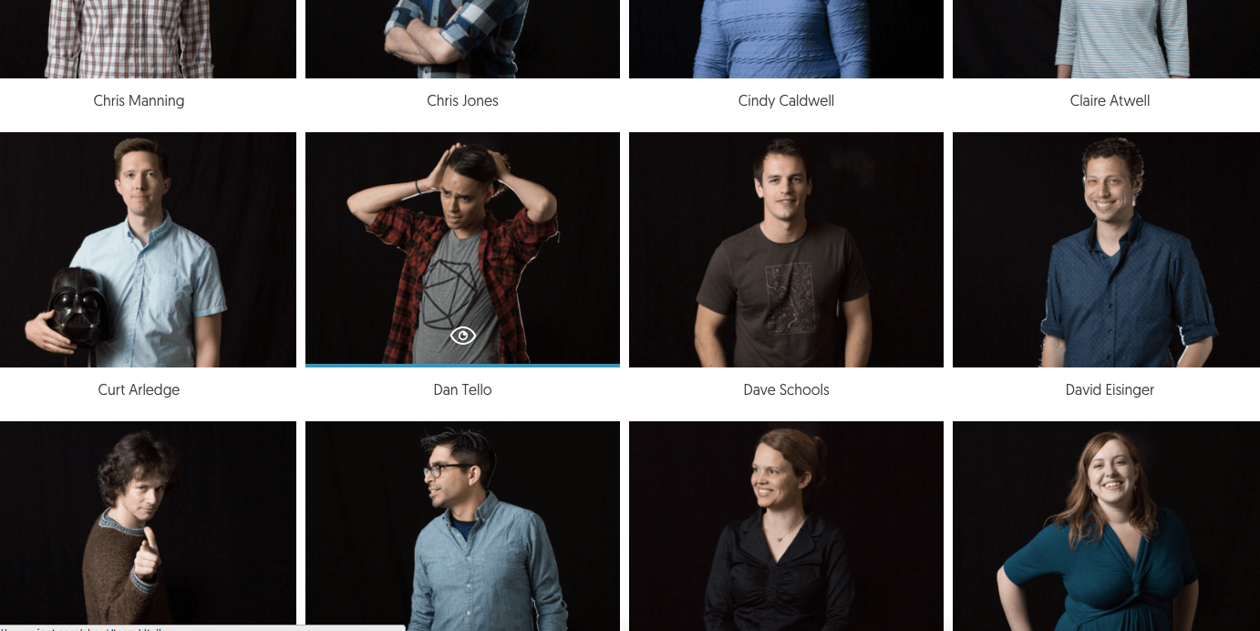
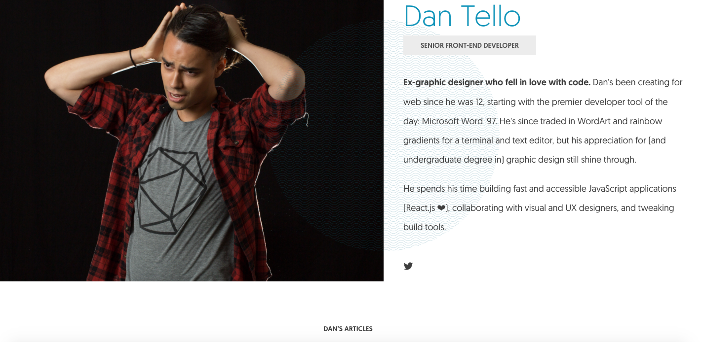
Viget does a great job once more. They have a huge team but they take the time and space to showcase each person. It really gives you sense of the power their resources and the culture of the agency.
Conclusion
You don’t have to be the cobbler or his filthy, shoeless kids. Investing time into your agency website will pay dividends if you practice what you preach by making your brand stand out, create copy that’s catered to your audience, showcase your team and case studies properly, and engage with your visitors.

Co-founder and CEO of Proposify, and co-host of the Levership podcast. Outside of Proposify, he plays in the band Club Sunday, who put out their first LP in 2023 and enjoy playing live shows every chance they get. Follow him on LinkedIn.
