Increase Proposal Close Rates by 23% with This Overlooked Feature
Published: October 24, 2019Updated: December 20, 2024

Thoughtfully designed proposals don’t just stand out from the crowd, they close faster than their vanilla counterparts, too. This post explains why you should take the time to reimagine the presentation of your business proposals using a Proposify feature hidden in plain sight.
If you’re frequently on the receiving end of business proposals, you’ve no doubt run into some shockers in your time.
You know the ones: Size 10 font; 600 words to a page; sent a week late by a sales rep from a company you don’t remember…
You know, these ones:
Let’s face it: you don’t want to sign this document. And if you have other offers on the table, you probably won’t sign it.
As you scan seven pages of nope and push it aside to move on to the next, a twinge of melancholy arises...
“Wasn’t this the company I was excited to do business with?” You might think...
“The one with the stunning website, killer branding, and ingenious solution to a big problem of mine?
“Then why does their business proposal look like the latest update of Apple’s terms and conditions? Is this really how they expect to convince me to commit to their company?”
Yes, a proposal needs to contain all the essential information detailing the mechanics of the deal; things like fees, timelines, project deliverables & milestones, terms & conditions, etc.
But facts and figures alone won’t determine whether that deal closes. What will decide the fate of the deal is the way you present that information.

Millions of proposals. Thousands of survey responses. Ten actionable takeaways.
The analysis and insight you need to dominate your deals in 2022 is right here.
Why proposal design and imagery matters
Dry and dull documents have their place in business. But not when it comes to your proposals.
Why? Because proposals are far more than a price attached to the bottom of a contract. They are an opportunity (maybe the final opportunity) to sell a potential customer on your company and your solution—to persuade and convince them to pick you and not your competition.
One key to making them pick you lies in how your proposal is designed. And I’m not talking about haphazardly throwing in some colours and shapes to make it look pretty—design goes far deeper than how something looks.
Good design is about how effectively information is communicated.
We did some data-digging around here at Proposify recently and one of the things we wanted to figure out was whether adding images to proposals, a crucial component of a well-designed document, affected the close rate.
What we discovered blew our minds. Including images in a proposal improved the close rate by 23%.

That's according to data from over 2.6M business proposals.
I know.
I mean, it kinda makes sense…
If your proposal stands out from the crowd of competing offers, it gets noticed. And if it gets noticed, chances are it’ll close.
No matter if you’re B2B, B2C; SaaS, PaaS, or any other acronym—one truth is universal: People don’t buy with logic; they buy with emotion, then rationalize it with logic after the fact. That emotion is elicited not in the information you present, but the way that information is communicated.
In a lot of ways, the design of a proposal is a reflection of those who sent it—how your viewer perceives your proposal will spill over into perceptions of your entire company.
A compelling, thoughtfully designed proposal represents a company who’s dedicated to the customer experience at every stage of the buyer journey. It’s an extension of their brand’s message and a snapshot into the quality of work you can expect from them.
On the other hand, if a proposal looks unorganized and sloppy, the company who sent them looks unorganized and sloppy, too—no matter if they’ve got the best prices in town.
How to use Proposify to find stock photos (that don’t look like stock photos)
We’re super proud of the family of integrations we’ve built over the years.
From chat tools to CRMs, project management software to invoicing apps; Proposify integrates with some of the leading business software in the world.
Which makes picking our favourite integration kind of like picking a favourite kid.
We love them all equally, but if we absolutely had to choose…
Unsplash would definitely be up there.
Who doesn’t love a library of over 1 million free (free!) beautiful photographs generously donated by shutterbugs around the world for you to use however you like?
Not all that long ago, finding decent business photos was a nightmare.
It meant spending hours sifting through stock photos for something that vaguely resembled actual humans interacting in a somewhat-believable manner.
Or, hiring an expensive photographer and wrangling your staff to spend half a day at a photoshoot.
Unsplash changes all of that. And with our Proposify/Unsplash integration, adding professional photos to your proposal is as easy as drag and drop.
How to add professional images to your proposal with one click
The Unsplash photo library is built right into the proposal editor on every single Proposify account.
Every image in the Unsplash library is original, high-resolution, and available for anyone to use for commercial and non-commercial purposes. There are no cumbersome copyright licenses restricting what you can and can’t do, no watermarks, and no asking for permission.
Here’s an overview of how to access and use Unsplash photos in your proposal editor presented by Luke, a designer here at Proposify.
With the Unsplash integration, adding beautiful, professional images to your proposal becomes as easy as searching for what you need and dropping it into your document.
Each image comes with irrevocable license to modify as you see fit, meaning you can make use of Proposify’s powerful image editor to adjust each image how you like.
Here’s a handful of quick and easy edits worth mastering to spruce up your document in no time:
- Adjusting the saturation and brightness of the photo is a simple way to reflect the tone of the content. Generally, bright and vivid equals happy and fun, while darker and muted makes for more sober viewing.

- Opacity is an indication of the transparency of the image. Reducing the opacity of a full-page photo lets written content pop.
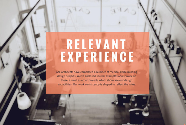
- Likewise, blurring the image is a great way to put the focus back on important text while still providing a visually compelling background. Here’s an example:

Power-up your pages
Sometimes subtle changes are all that’s needed to give a proposal the edge it needs to stand out from the crowd.
Remember, good design is about communicating information effectively, and, like any craft, there are tips and tricks to optimize that transfer of information.
Whether consciously or not, we’ve all been swayed by clever design—here’s one of my favourite recent examples from Apple, the oft-lauded benchmark of... well, everything.
Go on, have a look. I’ll be here when you get back.
…
That product film. Pretty neat, eh?
Even if you don’t have Apple-esque design resources at your disposal, there are simple ways to leverage the psychology of the user to elevate their viewing experience. And they’re entirely within reach.
Here’s Luke again to take you through some awesome perks nestled right inside the Proposify editor; ones you may have not known were there.
Two white rectangles on a three-degree tilt and you’ve got one sharp looking page. Anyone can do that, even if your design experience is, like mine, absolutely nil.
Establish consistency with repeaters
Proposify’s repeater mode removes the tedious manual entry of objects destined for multiple pages.
This makes it super easy to add repetitive items like shapes, textboxes (for stuff like disclaimers), headers and footers, and images to multiple pages at once.
Now, hang on: surely adding the same object to a couple of different pages on the odd occasion is no big deal, right?
Wrong.
Add up all of the instances where you’ve had to manually enter information into a sales document, double-checking it’s accurate while triple-checking you haven’t left anything out, and you’ve got a problem.
Time that should be dedicated selling is taken up by monotonous admin work that is easily automated.
Here at Proposify, we’re changing that—one footer at a time.
Here’s Luke for a final time to show you how to crop an Unsplash image and turn it into a repeating footer to give your entire document a consistent look and feel.
Impress your prospect with your next proposal
In highly competitive B2B markets, logic and reasoning play a lesser role in decision making than we like to think. In fact, buyers are more than twice as likely to consider a company that emphasizes personal and emotional value over business value.
Investing the time to reimagine your business proposals with thoughtful design and professional photos has a real impact, especially when yours is one of a dozen deals in front of a potential customer.
It’s worth it because well-designed proposals stand out. And proposals that stand out win deals.
Don’t give your prospect a reason to abandon your proposal with a dry-as-dust data dump. At this critical stage of the sales cycle, you need to lock their attention down till the last page; the one where they sign.


